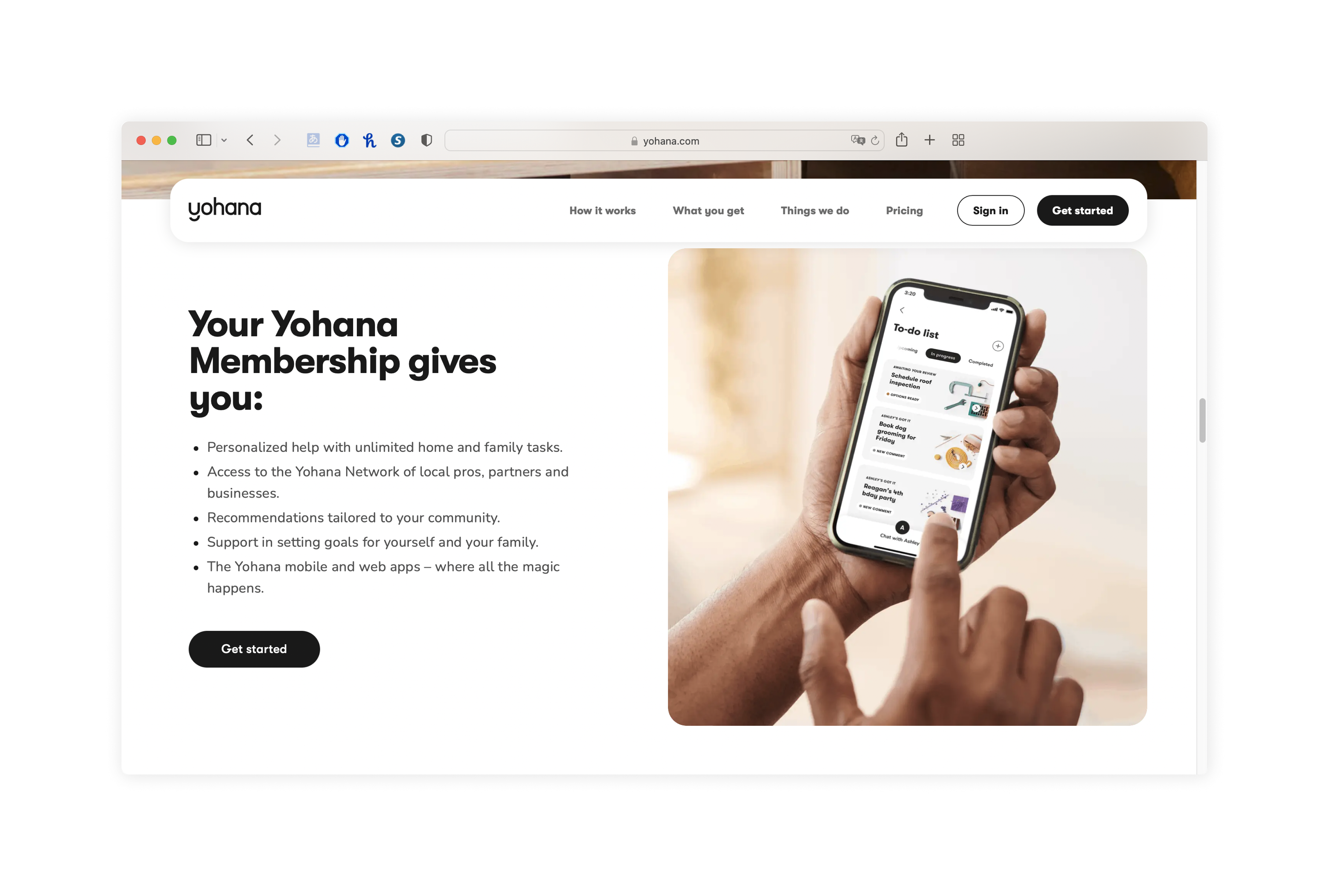
Service Introduction
Personal Assistant for Working Moms
Yohana was a personal assistant service helping working moms tackle everything on their ever-growing to-do lists. I joined the startup, which was funded by Panasonic, a few months after its founding and was able to contribute from the initial service design stages to our post-launch service and app improvements.
My Role
UX Designer
As a UX designer on the Member App team, I helped shape our member experience - from blueprinting and competitive analysis to Figma prototyping, usability testing, feature design, and building components for our design system.
Selected project
App Navigation Improvements
Post-launch, I led prototyping and visual design for an iterative, comprehensive usability study that laid the foundation for several new features and improvements. Informed by the results of this usability study, I later designed, handed off, and shipped navigation improvements for the company’s member-facing mobile app.
post-launch usability study
After the launch of our initial product, our member experience team started planning an iterative, comprehensive usability study to discover more about current users' experiences with our member app and identify opportunities for improvement.
building a complex app Prototype
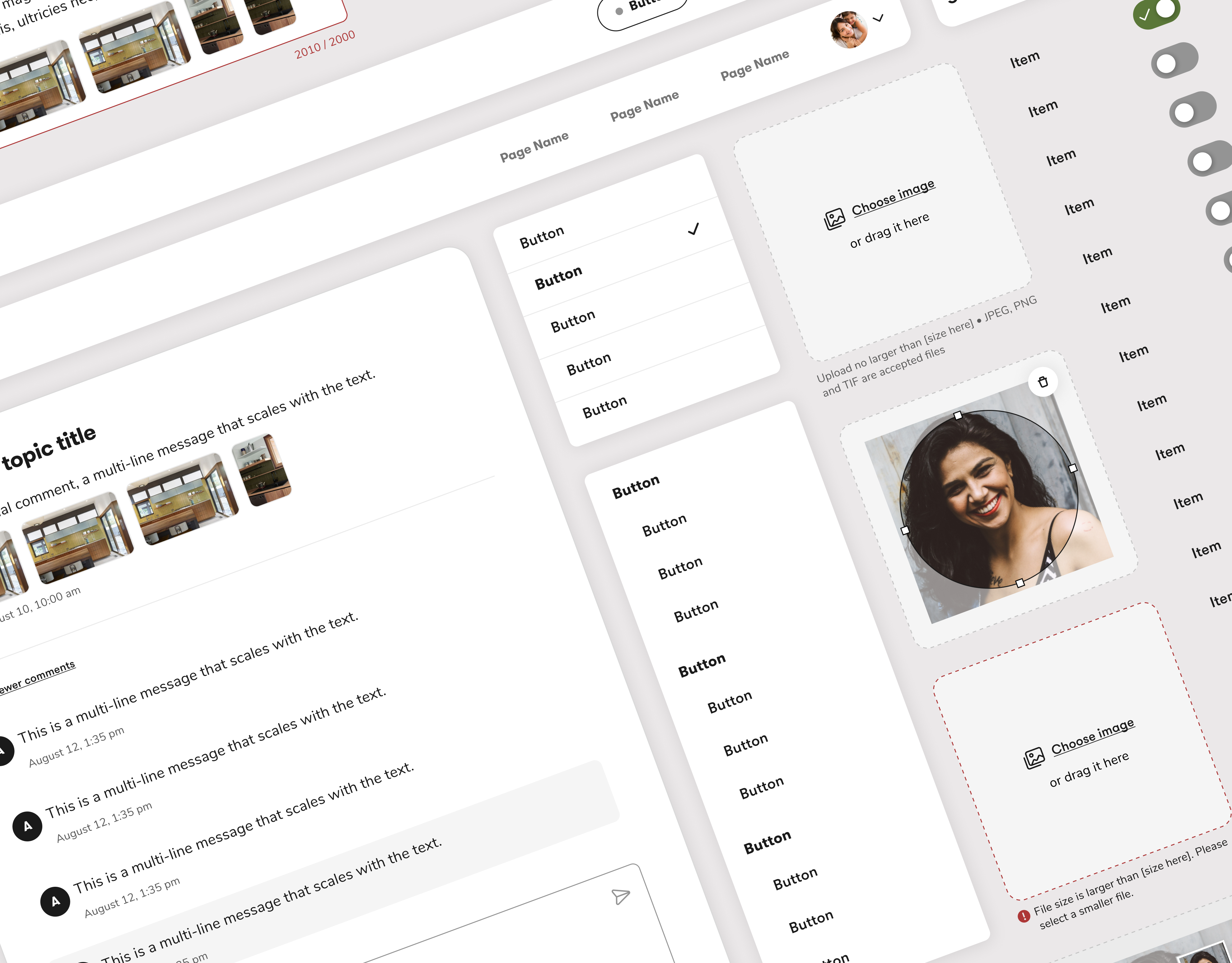
As the most experienced prototyper on my team, I built a complex prototype that allowed users to freely navigate the entire app. Since we were conducting this study using an iterative framework called RITE (Rapid Iterative Testing and Evaluation), I built it in a way that would allow for easy editing and iteration.
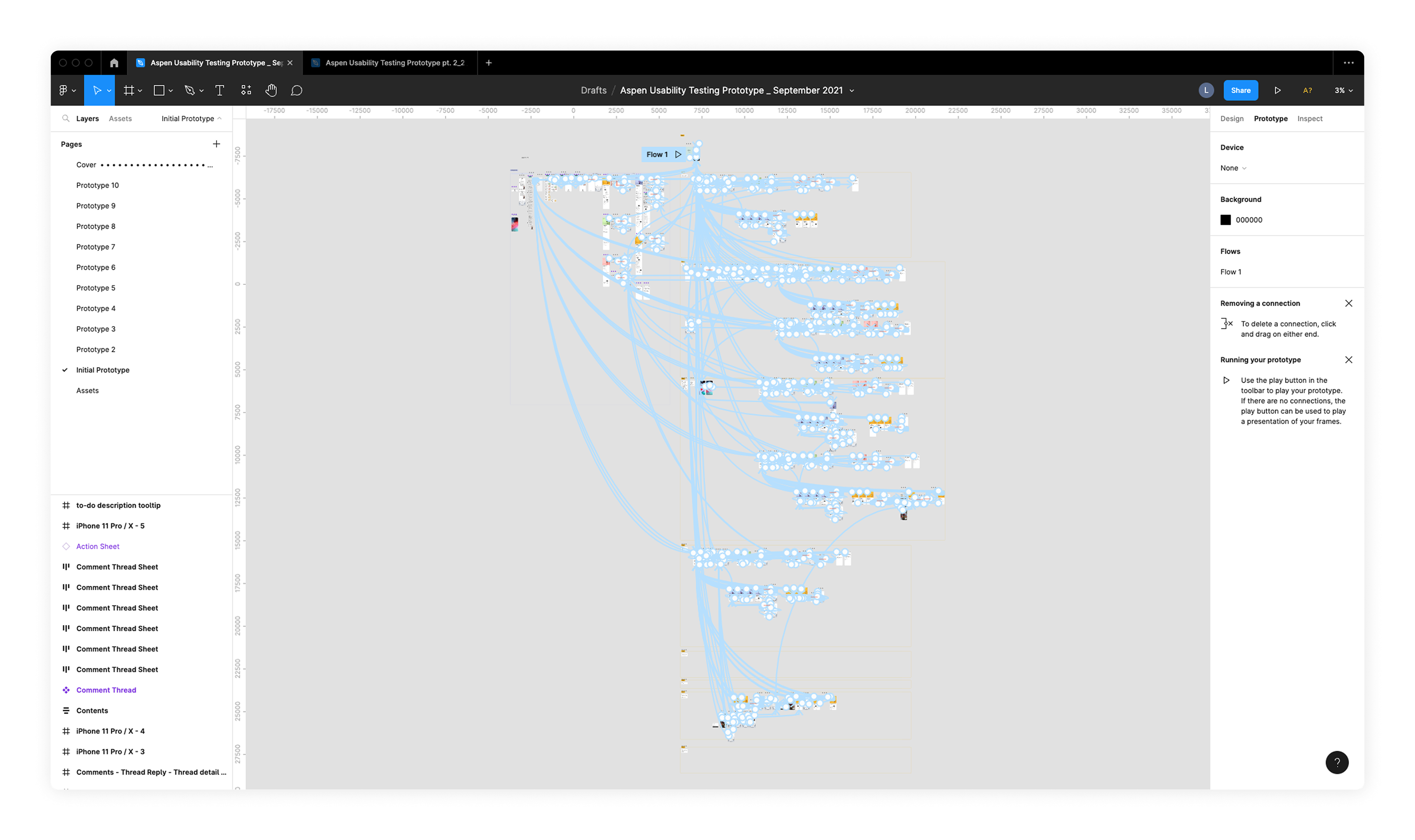
Usability testing prototype that I built in Figma for this study
Usability Study Insights
This study yielded two main insights:
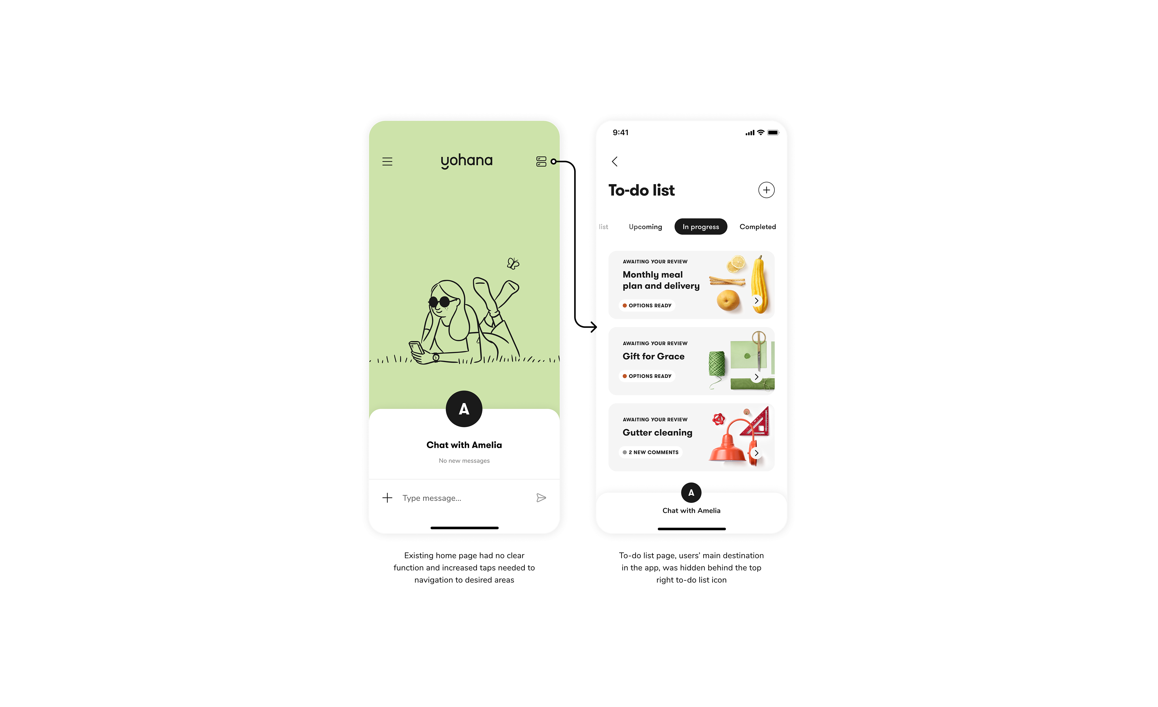
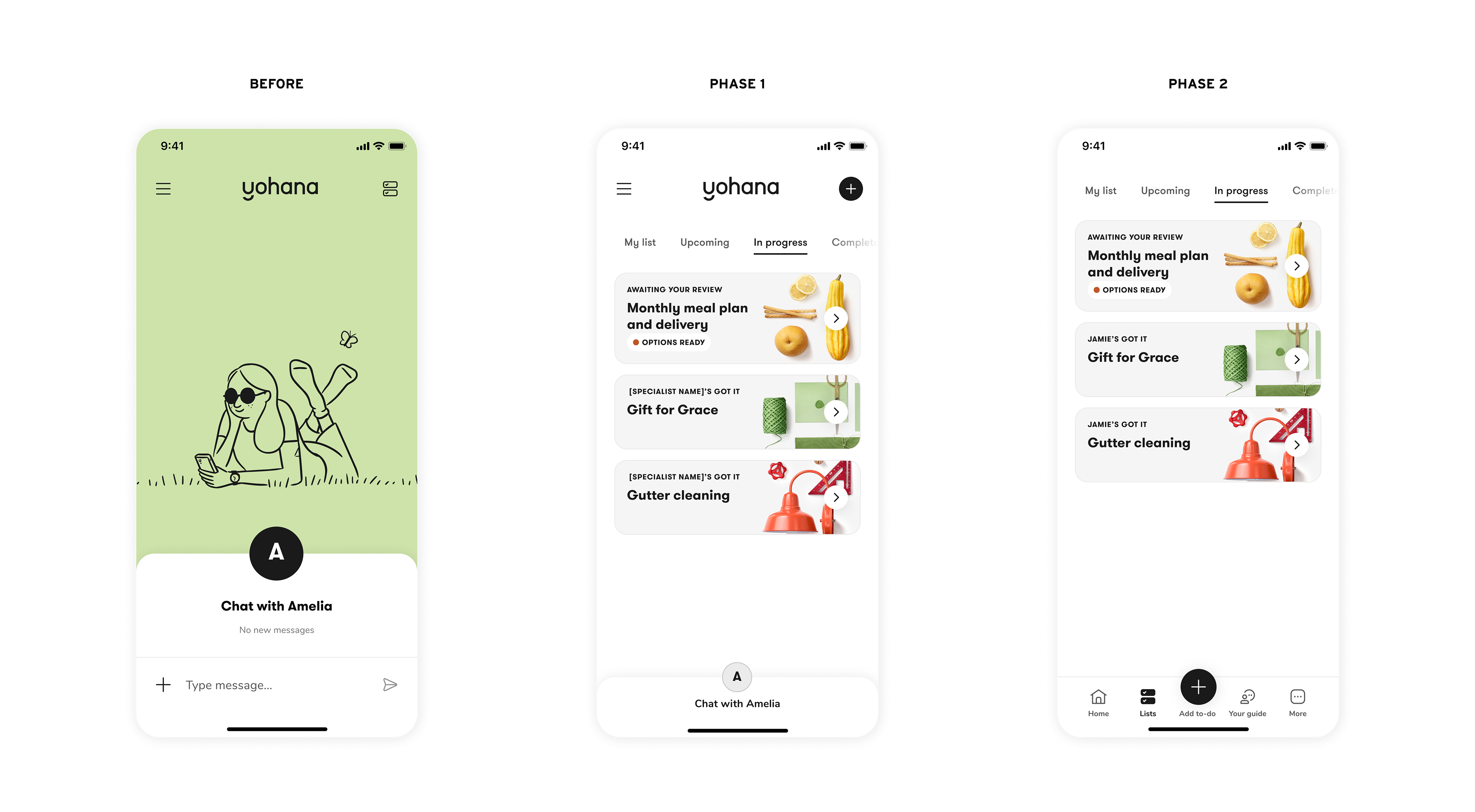
1. Useless home page causing user frustration
Users were frustrated about having to tap an icon on the existing home page, which had no clear function, to get to their to-do list page. They wanted to open the app and immediately view their to-do list. Many users also expressed an aversion to the home page illustration of a carefree woman sitting on the grass. Our app was supposed to help busy and overwhelmed members, and putting this imagery up front and center instead of focusing on offering a useful service was not resonating.
2. Outdated feature hierarchy hindering efficiency
In addition, we had designed the app based on the hypothesis that chatting with the assistant would be more important than referring to the to-do list, but after launch discovered that chat was not an efficient enough mode of interaction. As we added new features such as structured to-do intake to increase efficiency, having chat as a central feature on the home page no longer made sense. However, the outdated design of our app was still encouraging members to rely on chat, hindering efficiency.
Two-phase approach to navigation improvements
Based on the results of the usability study, we decided to break the navigation improvements into two phases. Phase 1 would incorporate quick fixes that we could implement sooner, and with Phase 2 we would launch a bottom navigation.
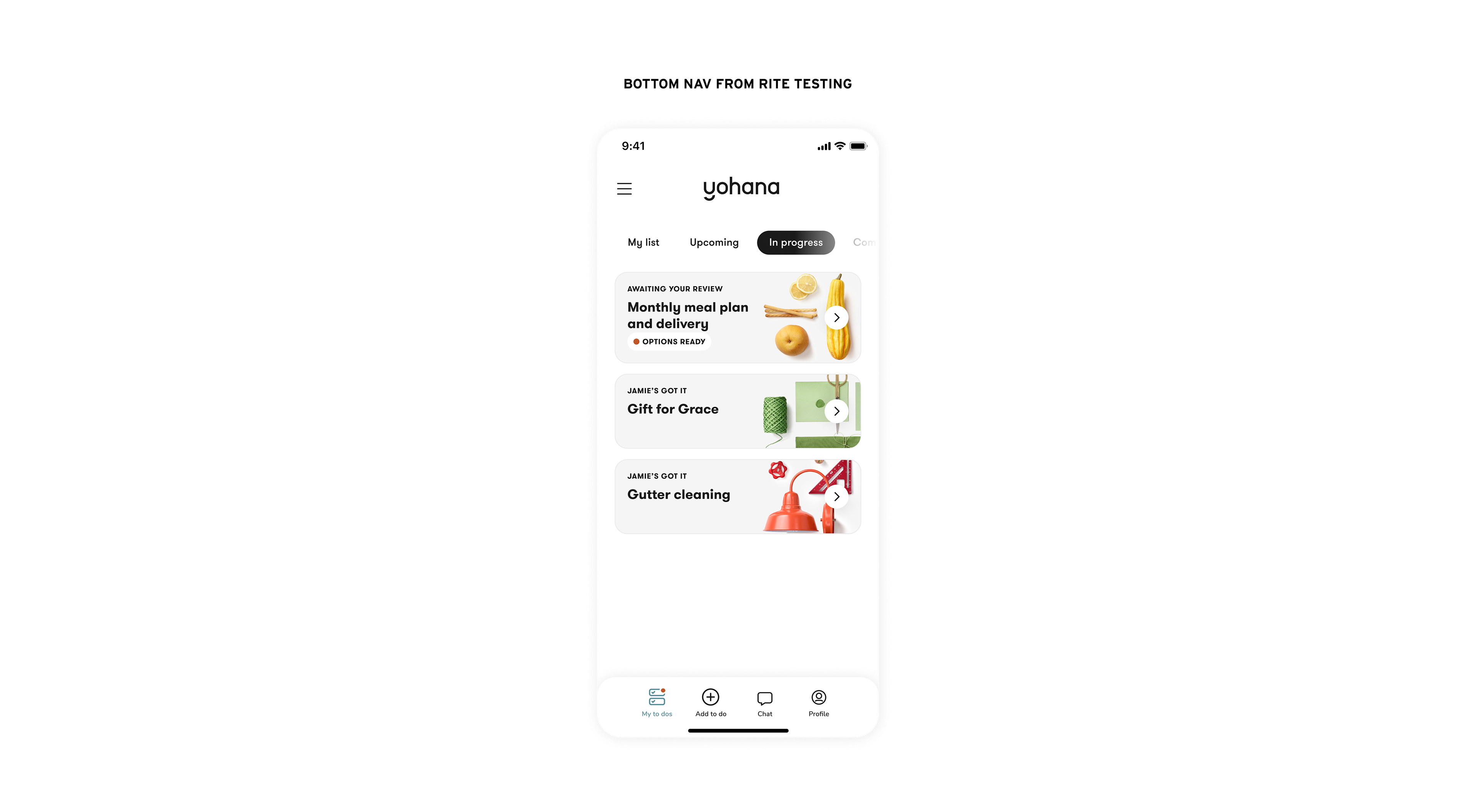
Phase one
quick fixes
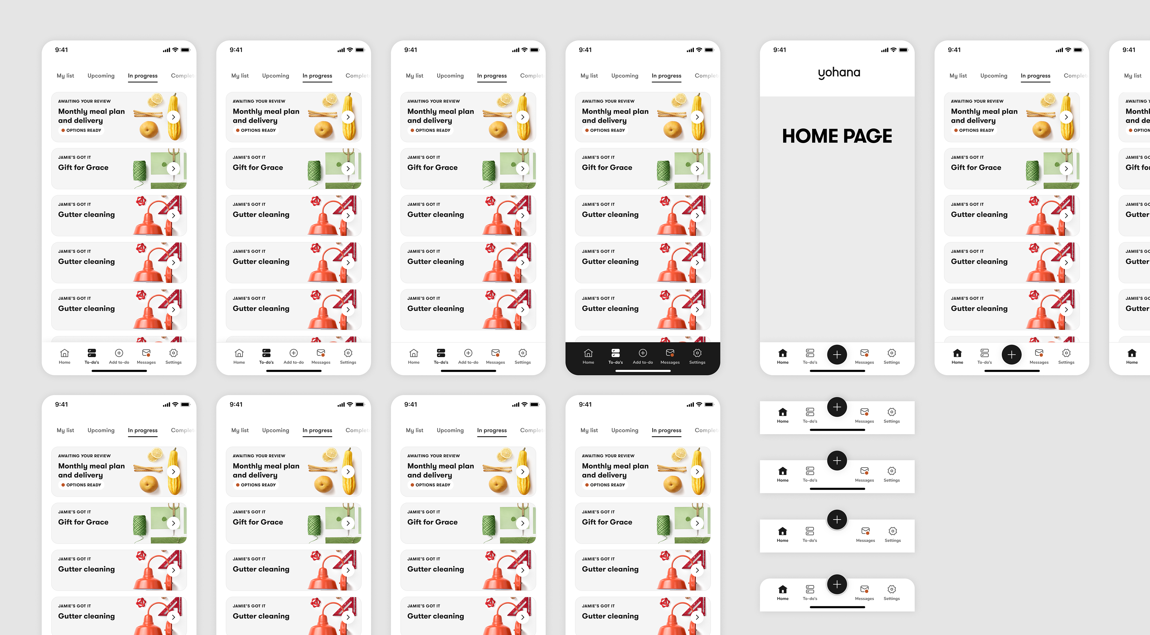
For phase 1, we decided to remove the existing home page and make the to-do list the home page to eliminate unnecessary taps. We also minimized the chat entry point to make it secondary to the to-do list content.
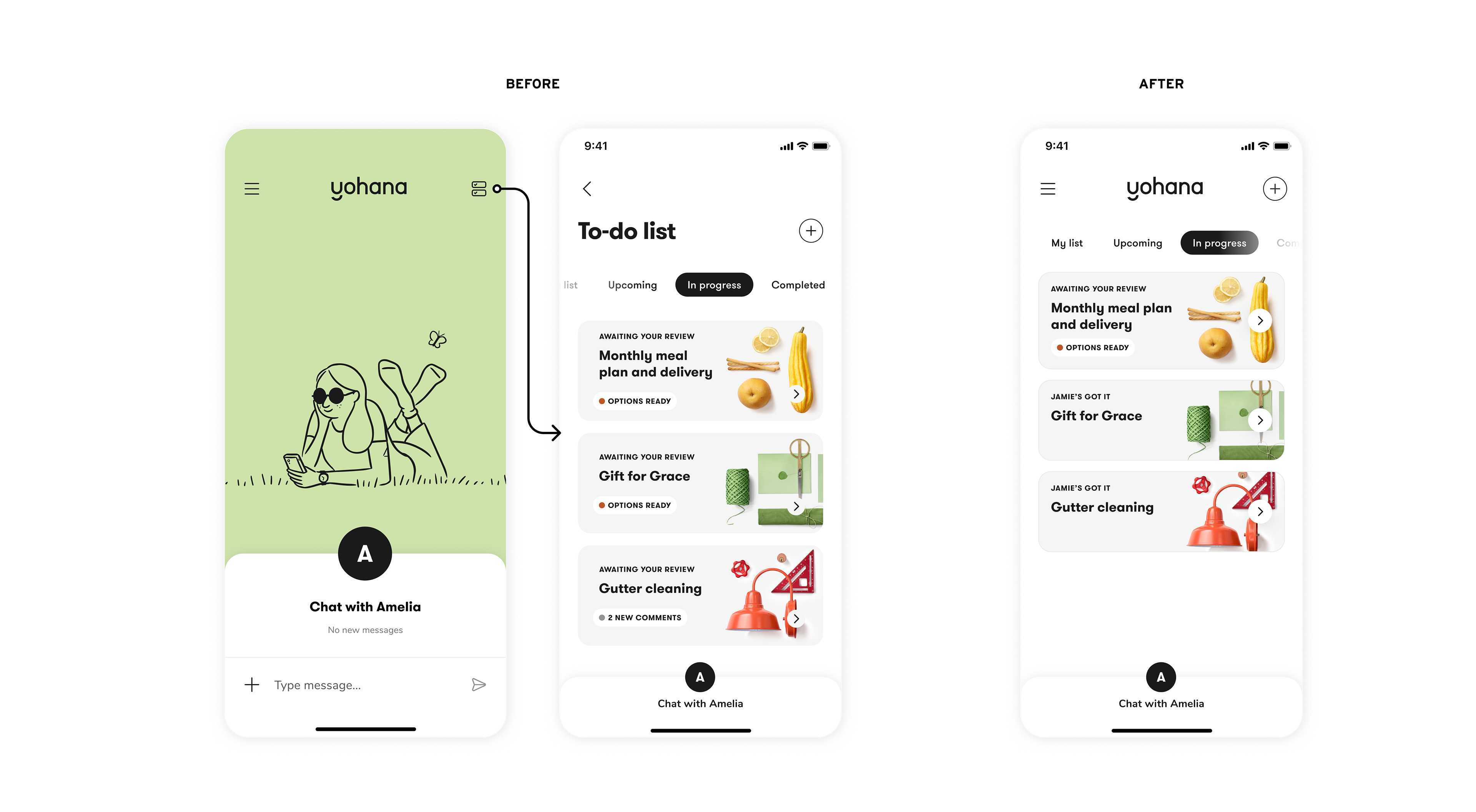
Using visual hierarchy to improve usability
Based on the fact that users were relying on chat to create new to-do's rather than using our structured to-do intake flow accessible via the + button in the top right, I recommended three visual design updates to further elevate the + button in the hierarchy of the page while de-emphasizing the chat entry point. These included:
- Changing the + button from a secondary (outline) to a primary (black fill) style
- Updating the tab button styles to improve hierarchy and better differentiate from buttons
- Changing the chat avatar color to lower contrast and reduce hierarchy
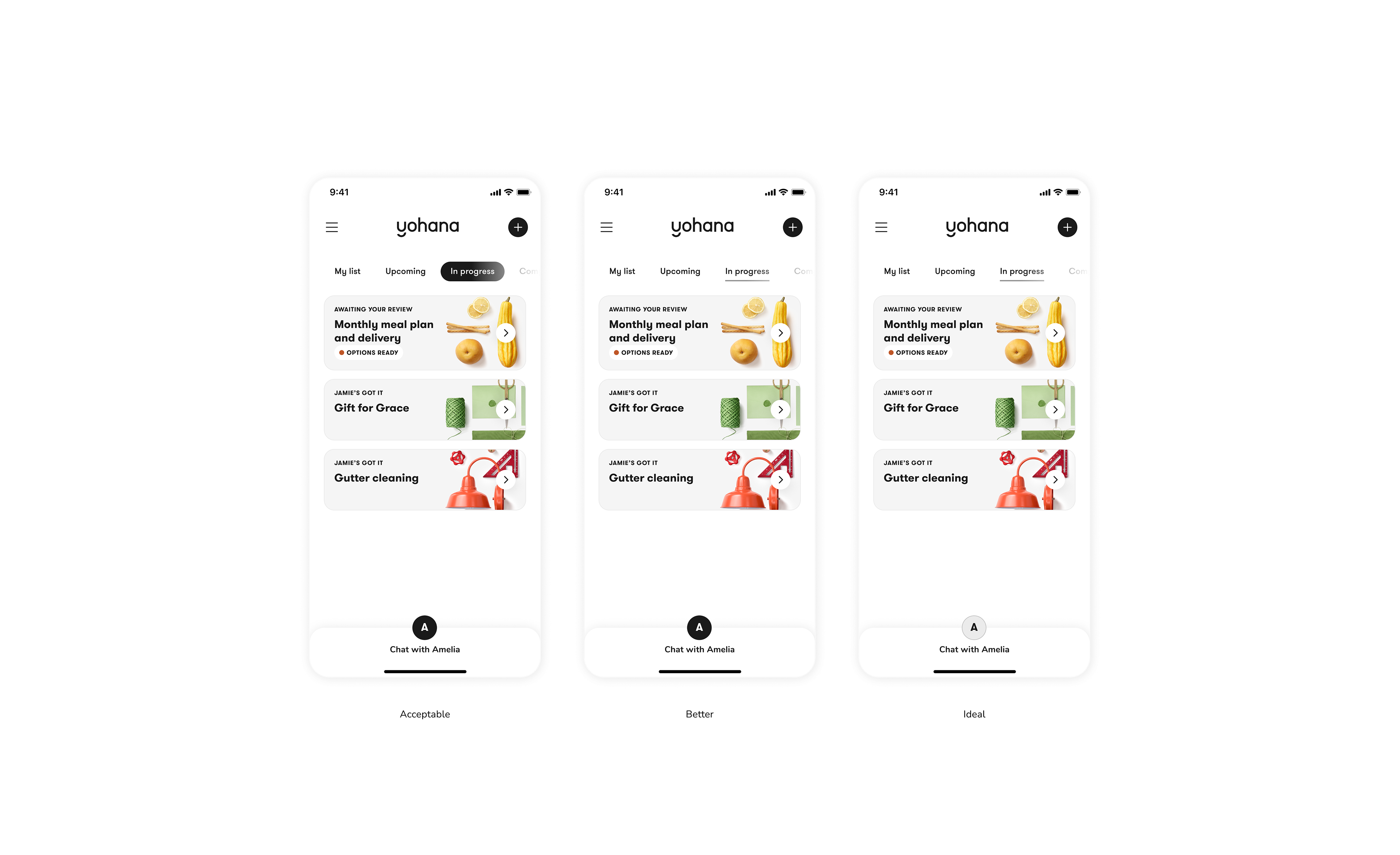
I presented 3 different options for V1 with progressive levels of engineering cost. We were able to move forward with my top recommendation (on the right).
Phase two
bottom navigation
For phase two, we decided to transition to a bottom navigation bar to simplify navigation within the app.
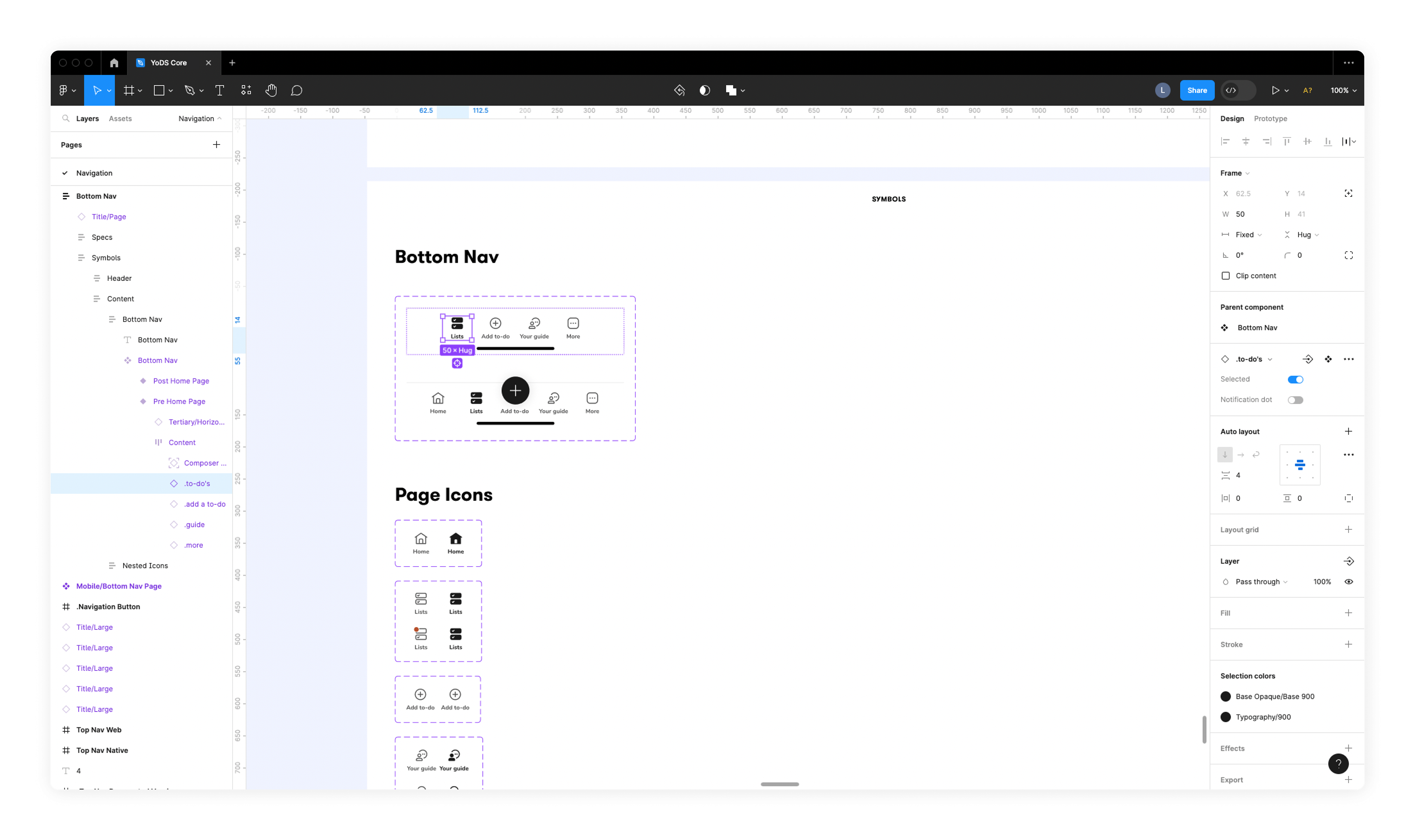
I led this work, conducting an audit of bottom navigation in other apps, designing the bottom nav with an emphasis on accessibility, and creating the component version for our design system. Throughout this project I interfaced with our product manager, engineering, content strategist, and design systems lead.
usability Test informed design
From our RITE usability test, we had already tested several iterations of a bottom nav. I used the design below as a starting point and got to work on designing a bottom nav that would make it easier for users to navigate the app and find what they were looking for.
In the usability test, we validated a bottom nav model that moved the assistant chat from being the central focus of the app to the same hierarchical level as the to-do list, the "add to-do" button, and the user's profile.
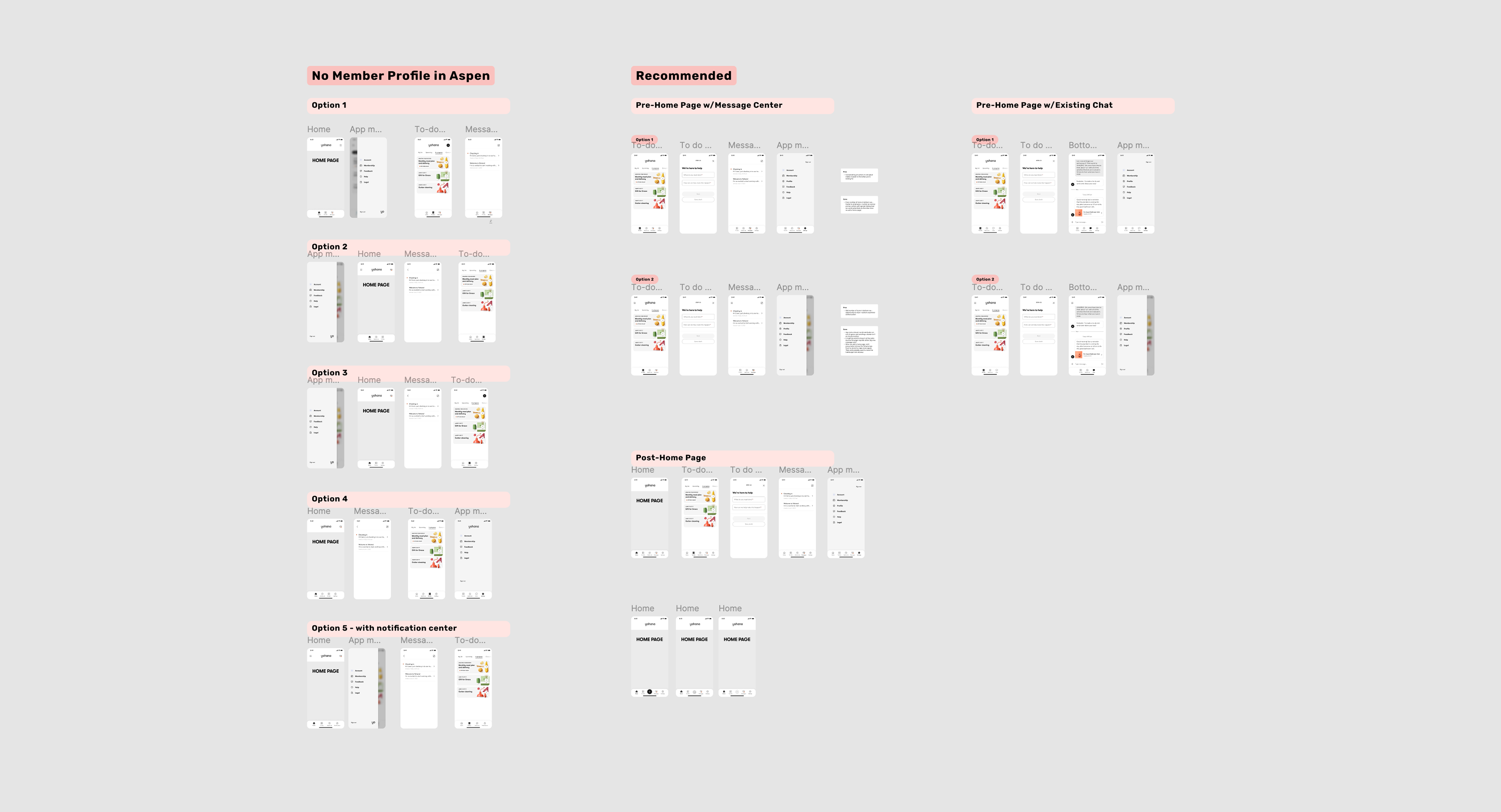
Information Architecture
In collaboration with our content strategist and product manager, I set about exploring the options for improving the information architecture of our member app.
I created visuals, including sitemaps, screen designs, and prototypes, to facilitate discussions between the different stakeholders so that we could determine which pages should be in the bottom navigation bar.
Bottom Nav visual design audit
Along with determining the information architecture and which pages should go in the bottom navigation bar, I also set about tackling the visual design. I conducted an audit of popular apps and other apps that included a "+ button." In this audit I categorized different apps' bottom nav bars to show the different visual types and trends that we might want to choose from for our own app.
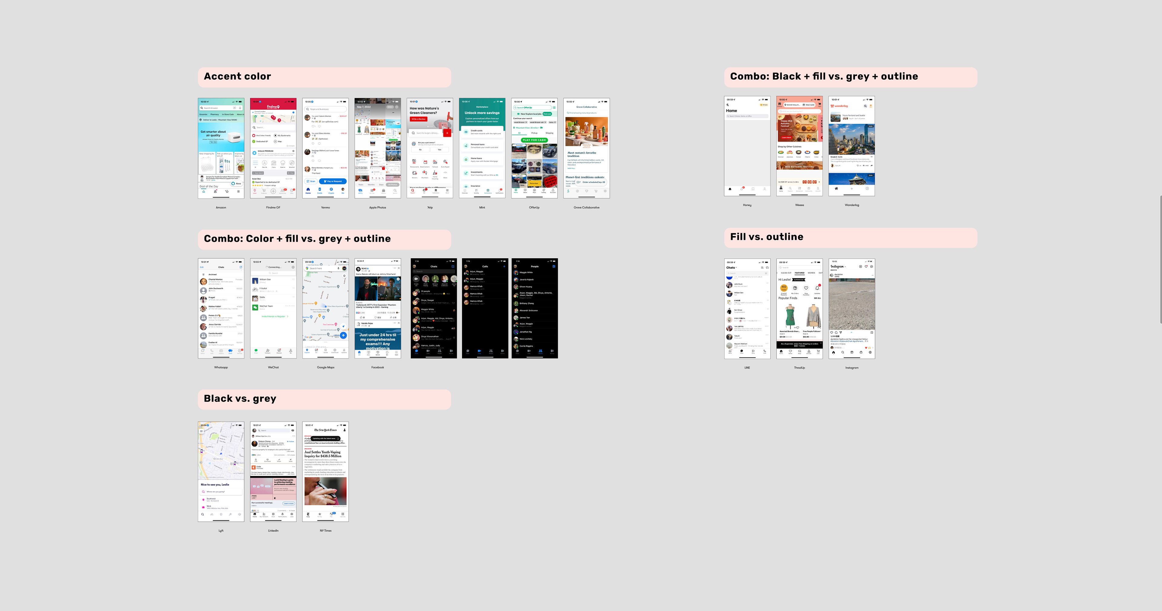
Accessibility
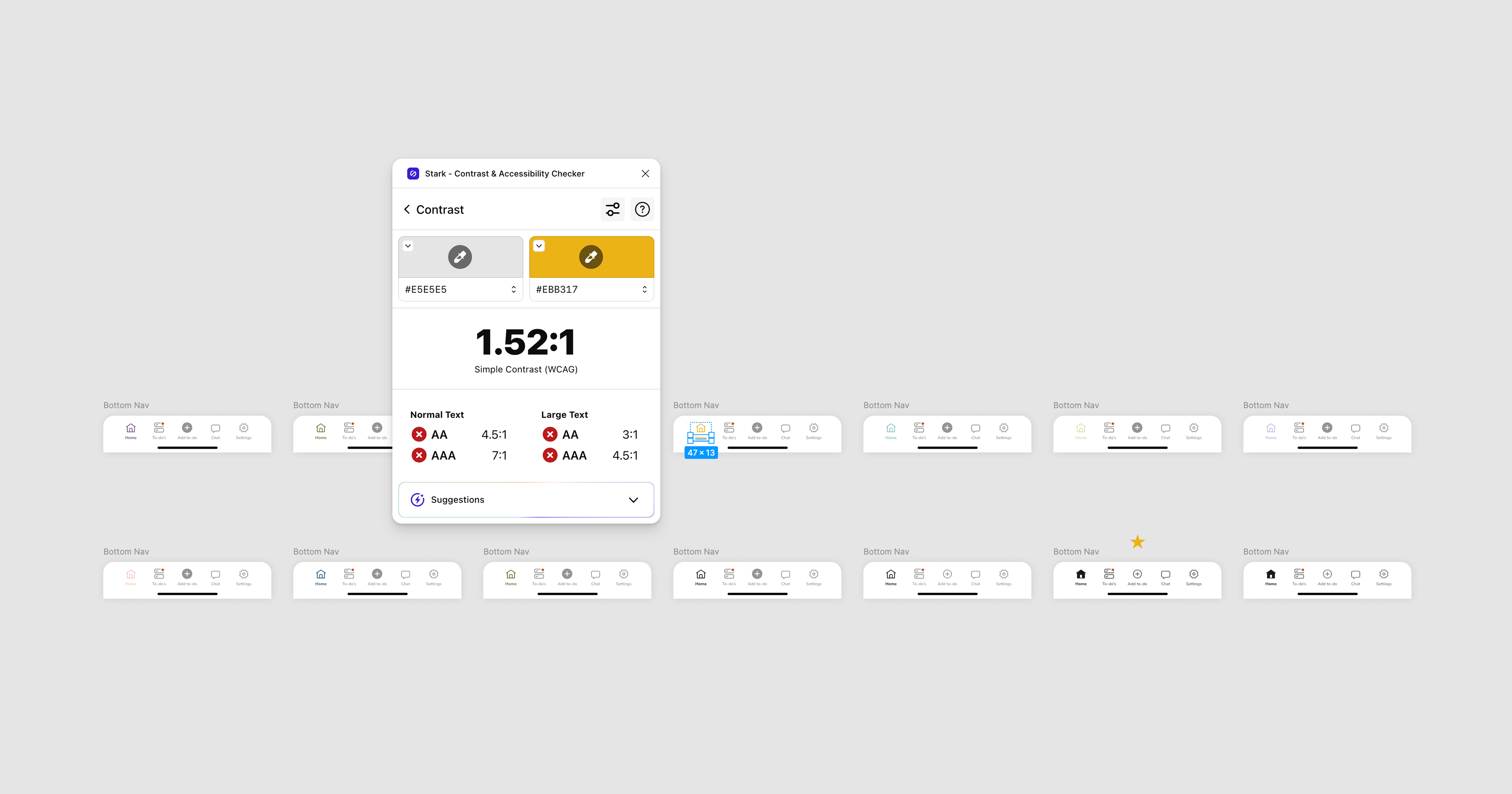
I also considered the accessibility of each type in order to narrow down the options and design our own bottom nav, testing whether we could use any brand colors as an accent color or not.
Visual Design Explorations
Using what I learned from my audit and accessibility checks, I explored various visual design possibilities before settling on the final design.
Design System Component Creation
After completing the design of the bottom navigation bar, I created the design system component, making sure it was easy to update in case we wanted to change the pages included later on. I also added the necessary new icons to our icon library.
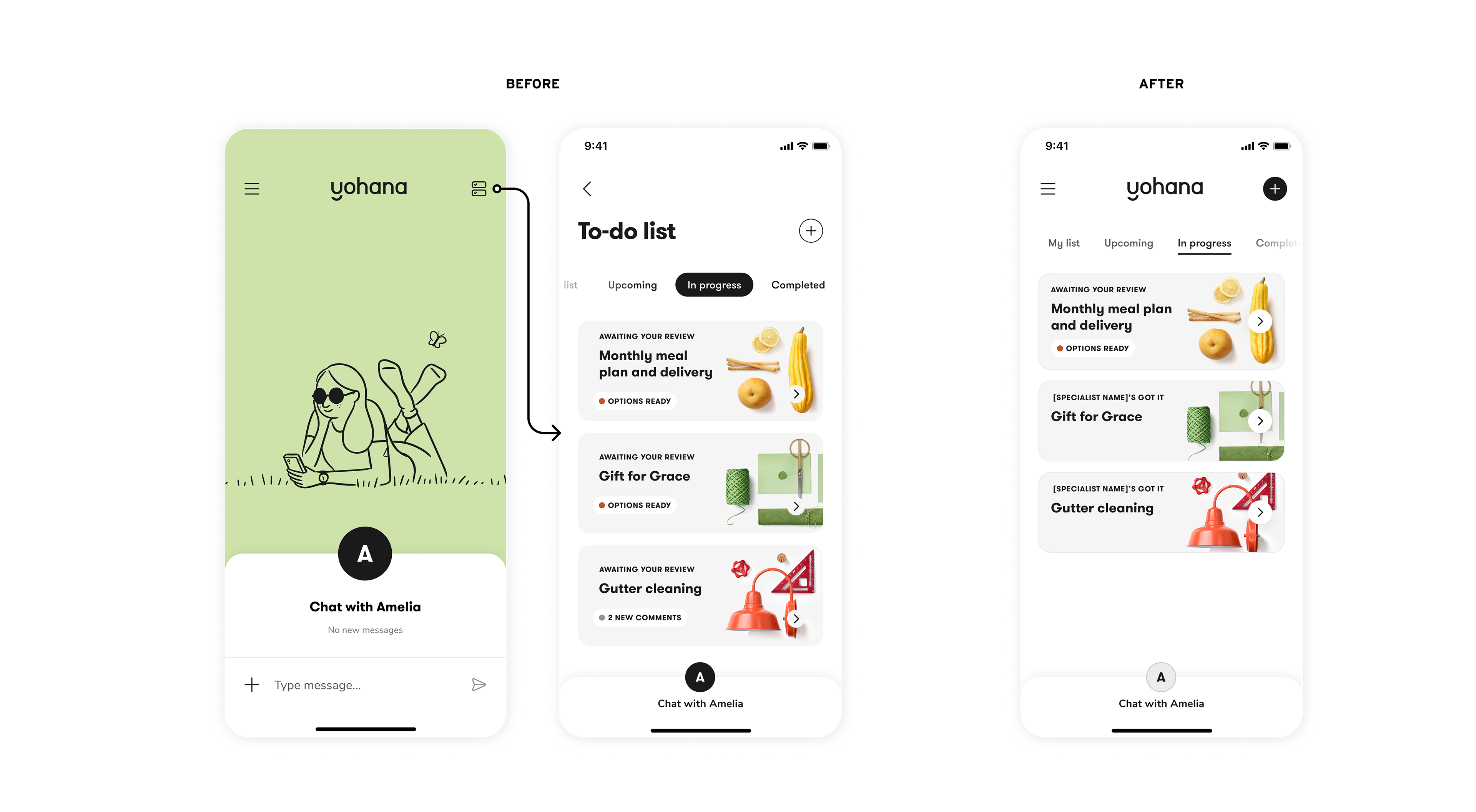
FInal design
Below you can see the transformation of our app's navigation structure, including the elimination of an empty homepage and the transition to a bottom navigation bar. These incremental changes made it much easier for members to use our app.
Impact
Thanks to our navigation improvements, users experienced less frustration with the member app, and usage of the structured to-do intake flow via the + button increased. This improved the efficiency of Yohana's service, lowering operational costs and increasing member satisfaction.