![](https://cdn.myportfolio.com/7d436ae37601cc032d9ba153973106e3/ac71014a-d252-4edb-8706-03966907b6b3_rw_1920.png?h=d77e8b90d536bab920b78a5d55888b45)
![](https://cdn.myportfolio.com/7d436ae37601cc032d9ba153973106e3/7e331533-4542-4193-bf51-7ebcc4b2f3e5_rw_1920.png?h=0fa1b15ee27c178323a908f7f6780ff2)
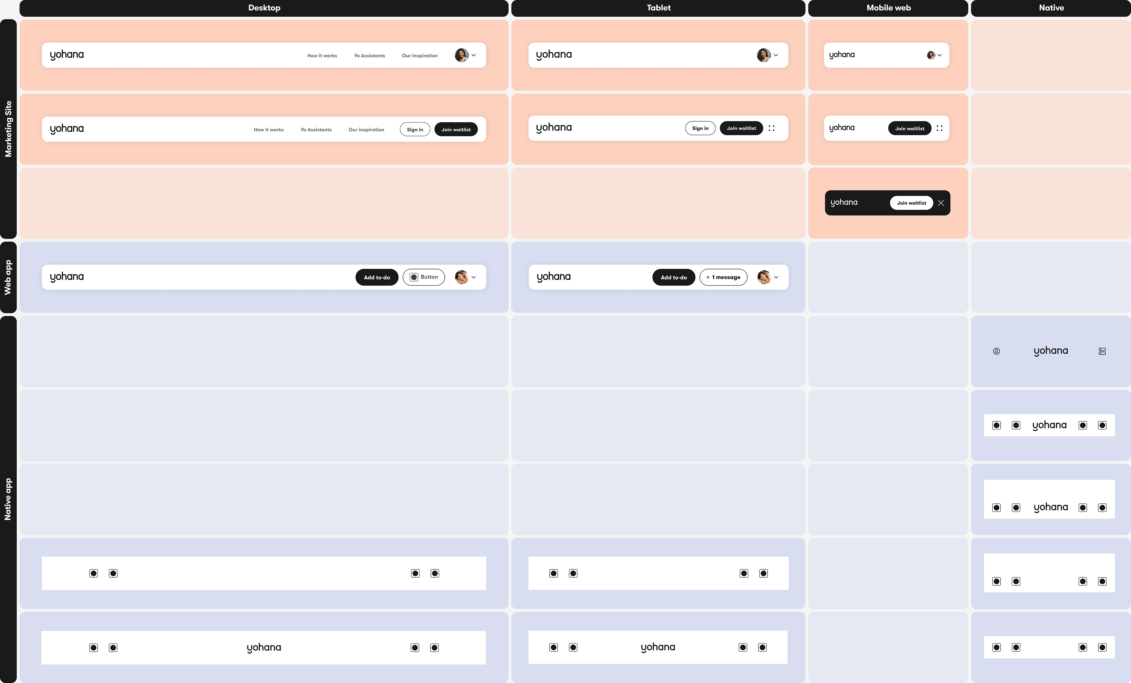
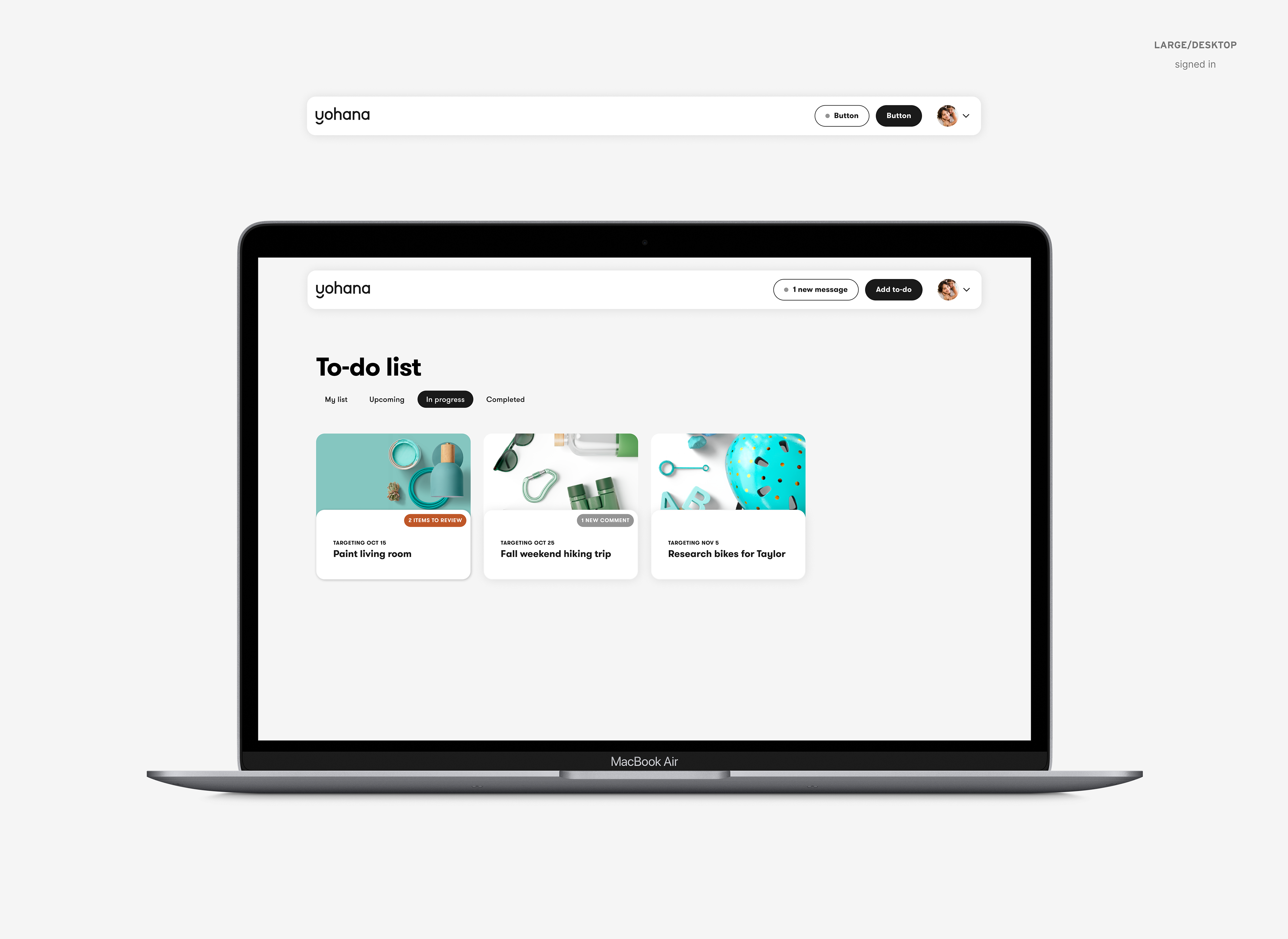
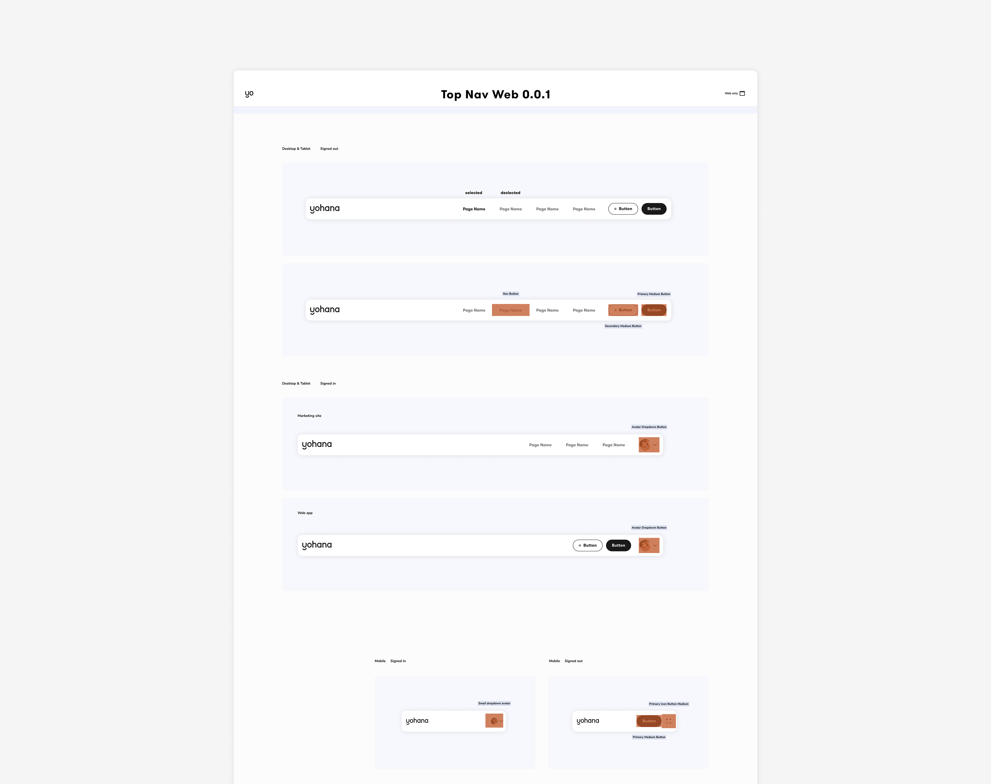
I conducted an audit of all the existing separate components for top navigation bars across marketing and product
![](https://cdn.myportfolio.com/7d436ae37601cc032d9ba153973106e3/2e85c67b-24ec-423d-8433-3ad35326ddfc_rw_1920.png?h=26e92ede30ea0688ffbdf52c9e076793)
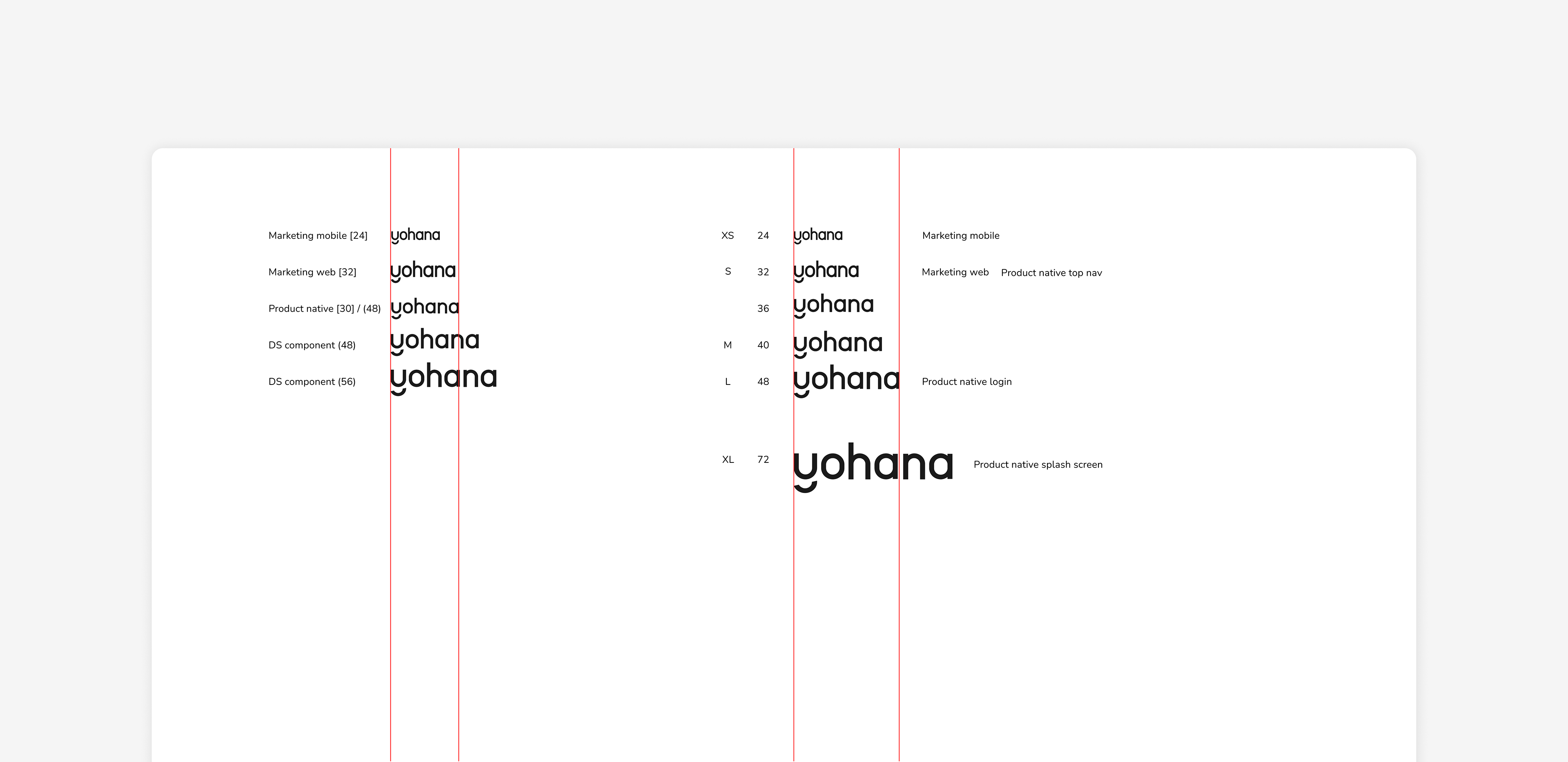
Logo size audit (left) and my new sizing structure exploration (right)
![](https://cdn.myportfolio.com/7d436ae37601cc032d9ba153973106e3/f6cdb329-8af1-429a-9ddd-fbca8cc9a24c_rw_1920.png?h=604c4cf30a860715e374efcf90613d83)
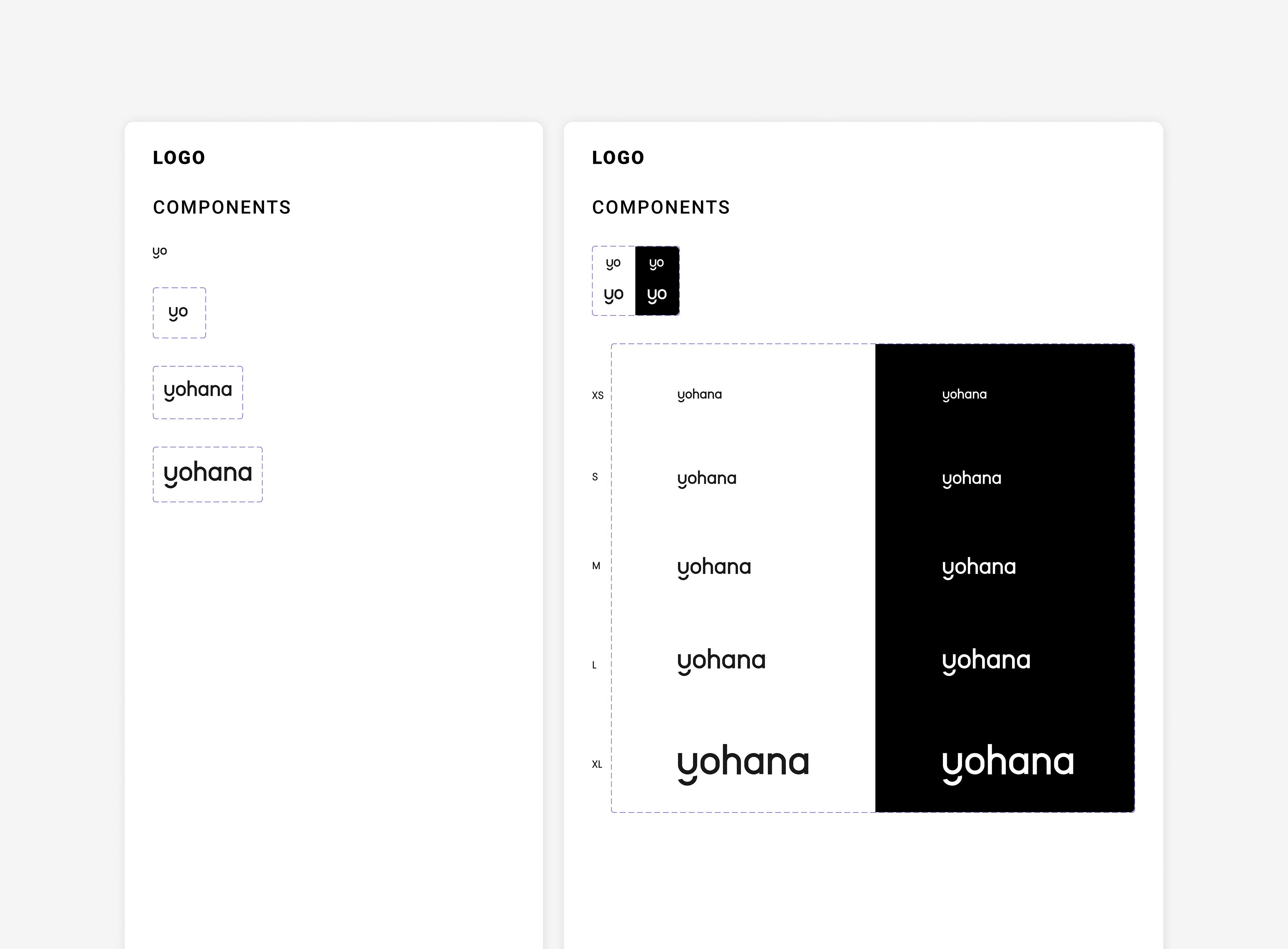
Our logo component before (left) and after (right) my standard sizing and light/dark mode work
![](https://cdn.myportfolio.com/7d436ae37601cc032d9ba153973106e3/97999616-2a9d-4986-98de-578928a30167_rw_1920.png?h=50bb4fc90ae54ed272d9c3119a125541)
![](https://cdn.myportfolio.com/7d436ae37601cc032d9ba153973106e3/f601cd20-af0e-45b1-afa1-5acb0a2e5b29_rw_1920.png?h=f4a55b6cd36fa289d07177ea334258b2)
![](https://cdn.myportfolio.com/7d436ae37601cc032d9ba153973106e3/33400973-5467-439d-8a5f-c4cb6ad3c0af_rw_1920.png?h=d39b4183af2438d74b8c86d1b3fb978c)
![](https://cdn.myportfolio.com/7d436ae37601cc032d9ba153973106e3/cd385e9a-6c0f-4b15-b6c8-352d195fad19_rw_1920.png?h=2cafdc7bf9932d30a7b4b5459298a985)
Design system technical documentation
![](https://cdn.myportfolio.com/7d436ae37601cc032d9ba153973106e3/c0aea7ae-b9cf-43fe-899e-0e02ceb84325_rw_1920.png?h=52640fe9a3d08ce44043e37abdee9ad8)
Originally, our icon components and the export frames were kept in two separate files
![](https://cdn.myportfolio.com/7d436ae37601cc032d9ba153973106e3/26ee314a-b759-4f88-bc6b-f24b4eedbf5a_rw_1920.png?h=9a377aec653fcde7d67b568401c64e93)
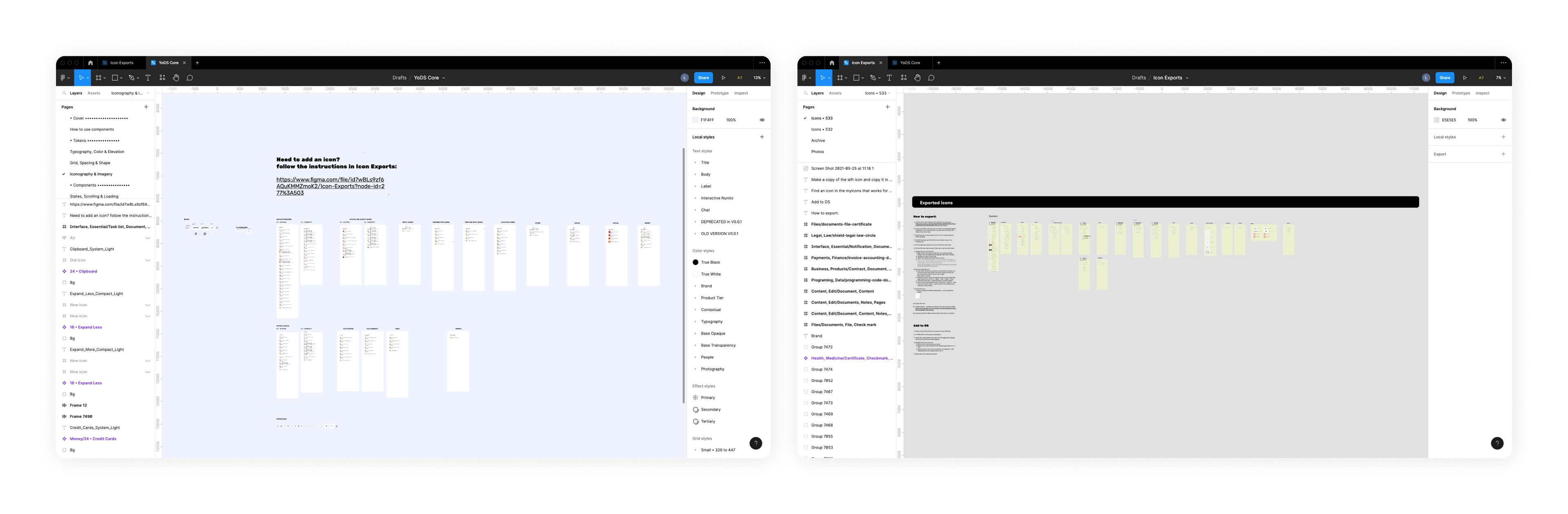
The existing icon library was messy, redundant, and inefficient and required keeping two different files up to date
![](https://cdn.myportfolio.com/7d436ae37601cc032d9ba153973106e3/c8640f94-6f56-403f-8f4a-dd3cc0cf9ca7_rw_1920.png?h=17b0c3f84b06fdde7aa33f3d6a8ddcaf)
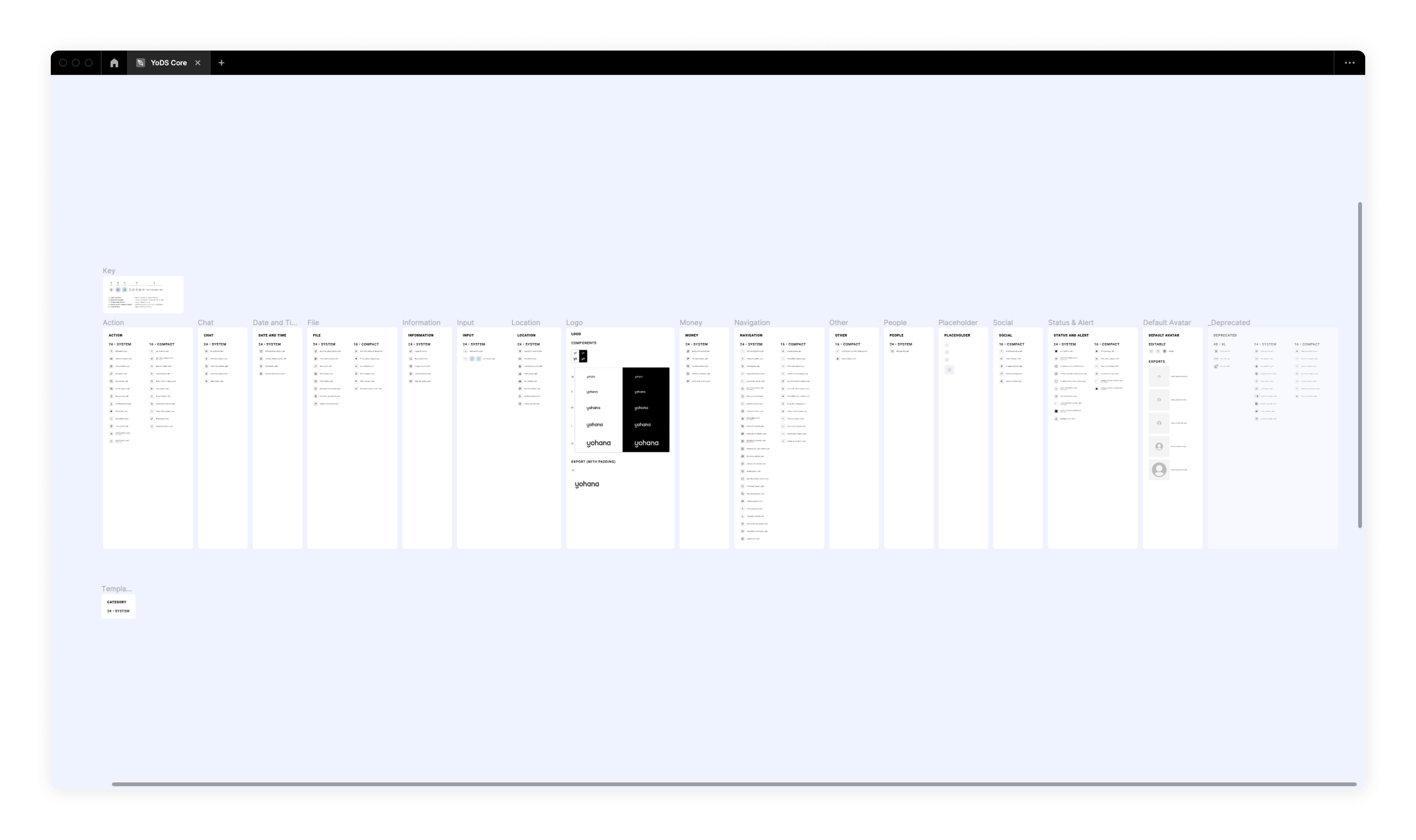
Our new consolidated icon library after my reorganization process
![](https://cdn.myportfolio.com/7d436ae37601cc032d9ba153973106e3/188f03ff-3a5e-41b2-93eb-f3f0eb7fe53f_rw_1920.png?h=b94d6c37bf5ae0d92572bef991af98f2)
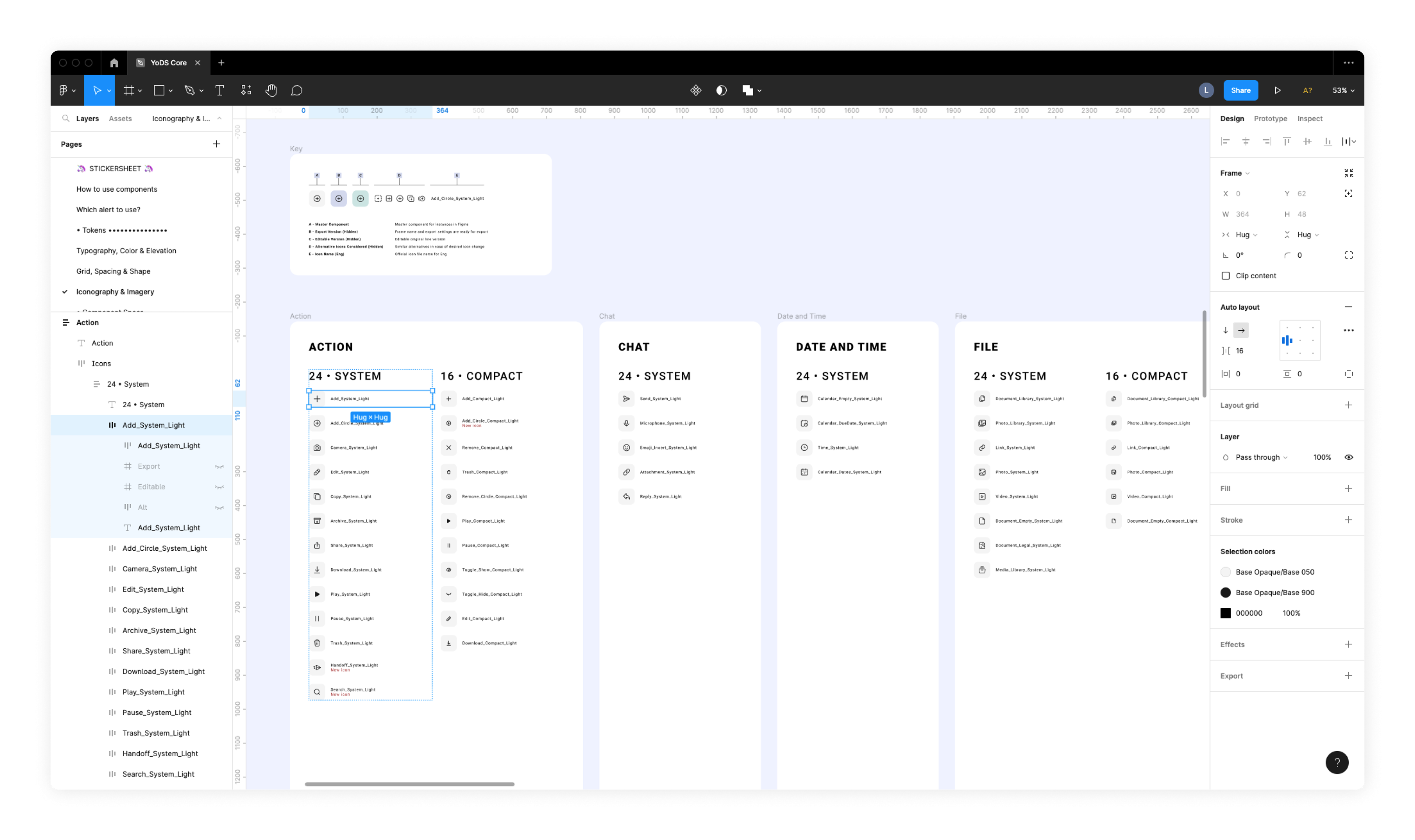
I took advantage of Figma's auto layout feature to organize all of the icons into rows and categories
![](https://cdn.myportfolio.com/7d436ae37601cc032d9ba153973106e3/6f31a4ba-af89-4641-8124-6af2a63ccfe5_rw_1920.png?h=3de2d18209d874673404765678aa8f67)
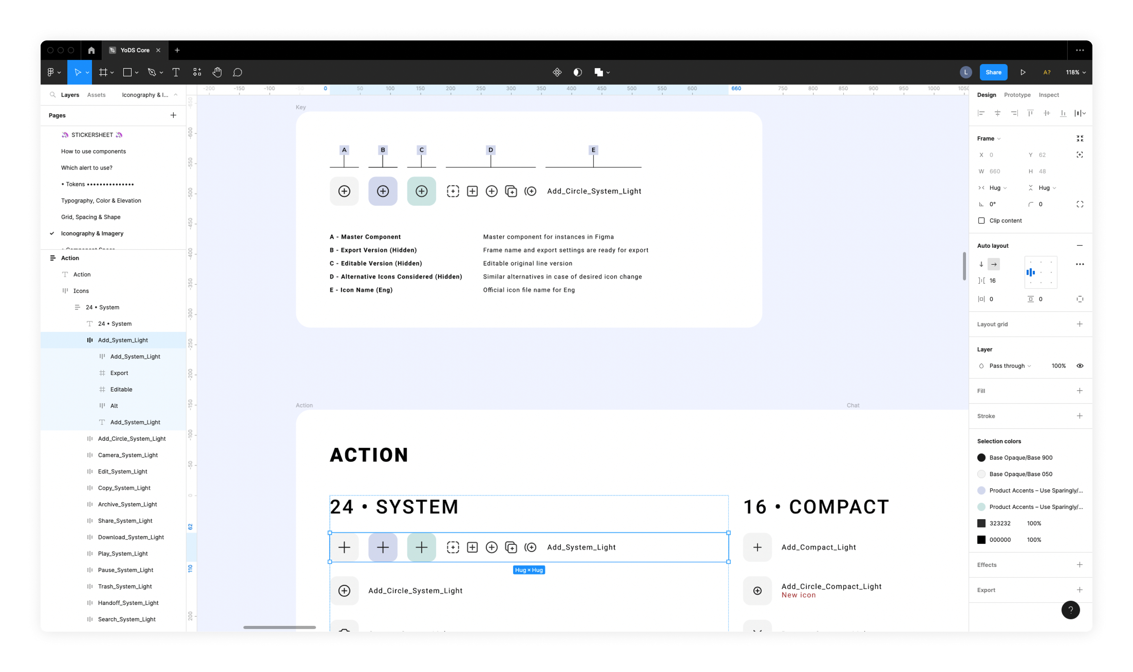
Each icon row now houses the DS component, export version, editable linework version, and alternate icons considered. I color-coded the different versions to make them easy to distinguish and hid all but the DS component to prevent confusion.
![](https://cdn.myportfolio.com/7d436ae37601cc032d9ba153973106e3/49564e3d-1c15-4636-bdc0-9b6be54ba54d_rw_1920.png?h=20000500776a40357118240e348fc0b5)
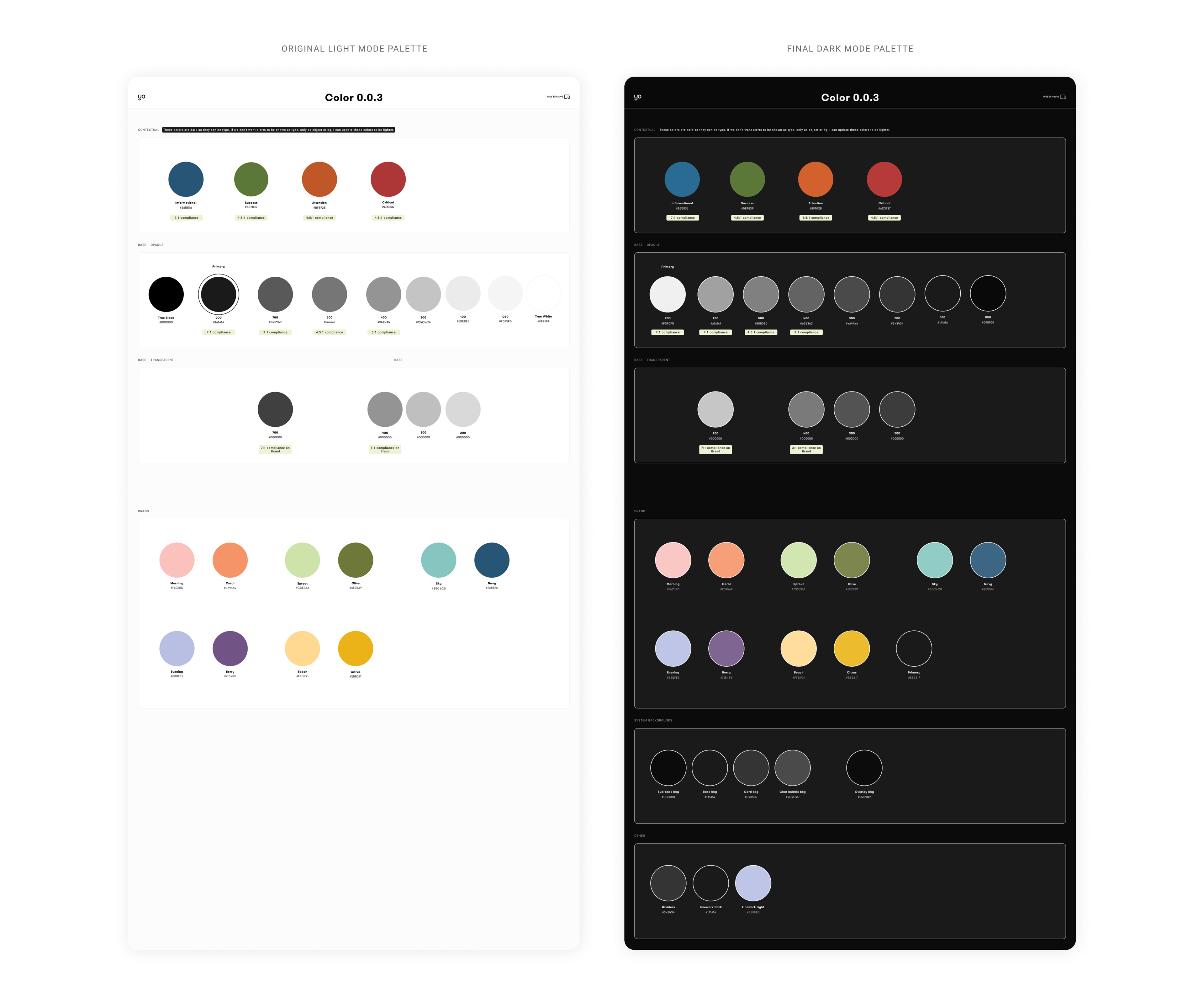
Original light mode color palette alongside the dark mode color palette I created, which included my recommended structural changes to be applied to both modes in order to enable 1:1 switching