Task
Redesigning a crucial customer-facing healthcare tool
After experiencing personal frustration trying to find out how much a prescription would cost with my insurance, I decided to redesign my insurance company's drug cost look-up tool. 
Using the tool firsthand, I saw much room for improvement and set to work applying my human-centered design approach and knowledge of usability, web design, and accessibility to reimagine a more user friendly alternative. 
The Problem
Usability issues + excessive alerts frustrate already stressed users
My starting point was an existing insurance company's drug cost look-up web tool. Littered with usability issues and inaccurate alerts, this tool adds unnecessary stress and worry to a user who is already nervous about how much their prescription might cost. By streamlining the process of looking up their prescription cost, I saw an opportunity to make a positive difference in the life of a person trying to address their health concerns. The problem may be simple, but the impact would be disproportionately large - part of the reason I chose this tool to redesign. 
Let's take a look at the original tool:

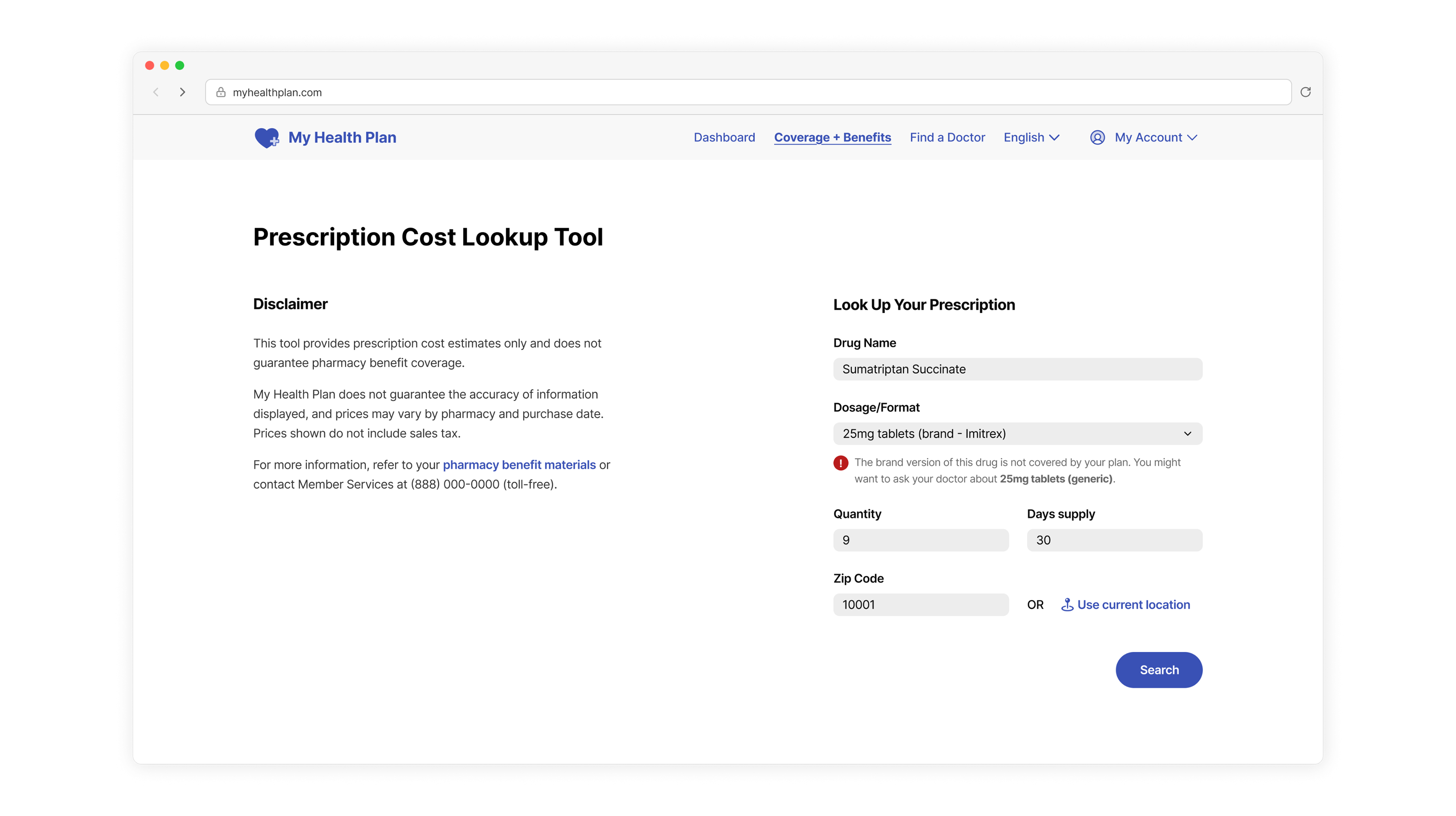
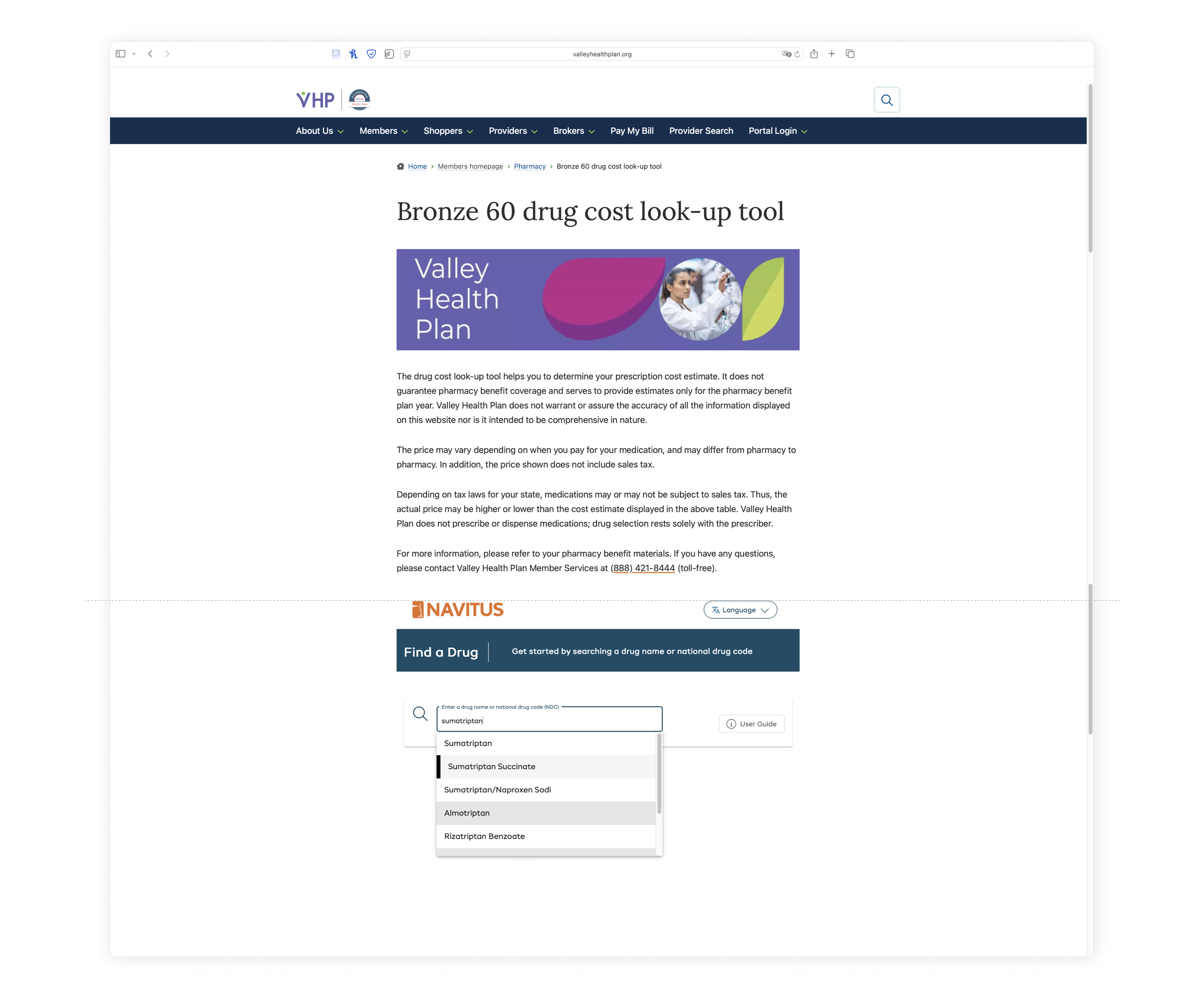
The user scrolls down past the fold line after a large banner and quite long disclaimer before typing in the name of their prescription to begin their cost lookup process. 

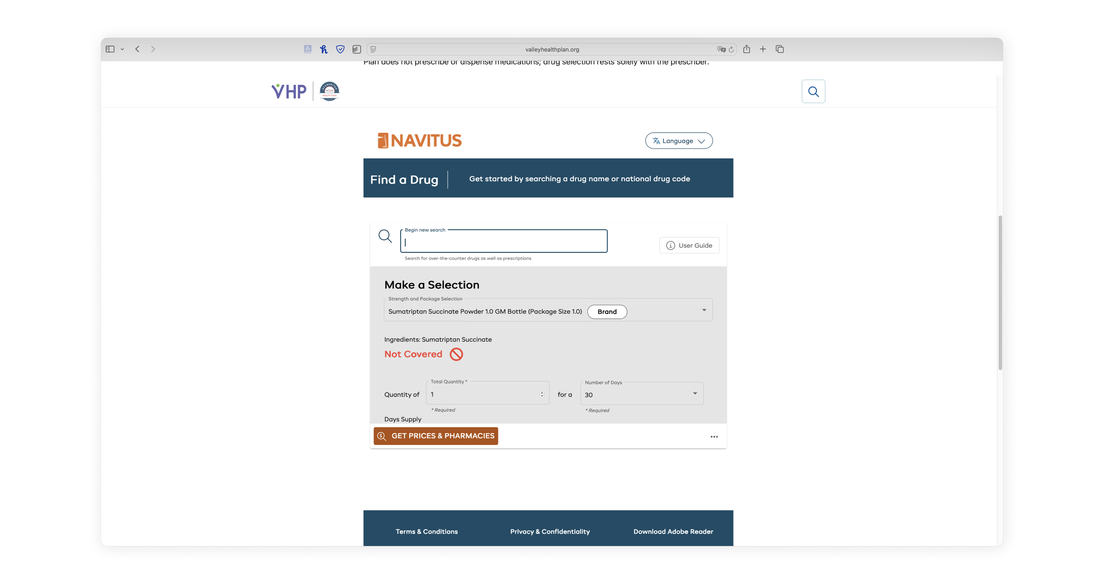
Before even choosing the drug variant, the user is alarmed by a bright red "Not Covered" inline alert, due to the database's default variant not being covered

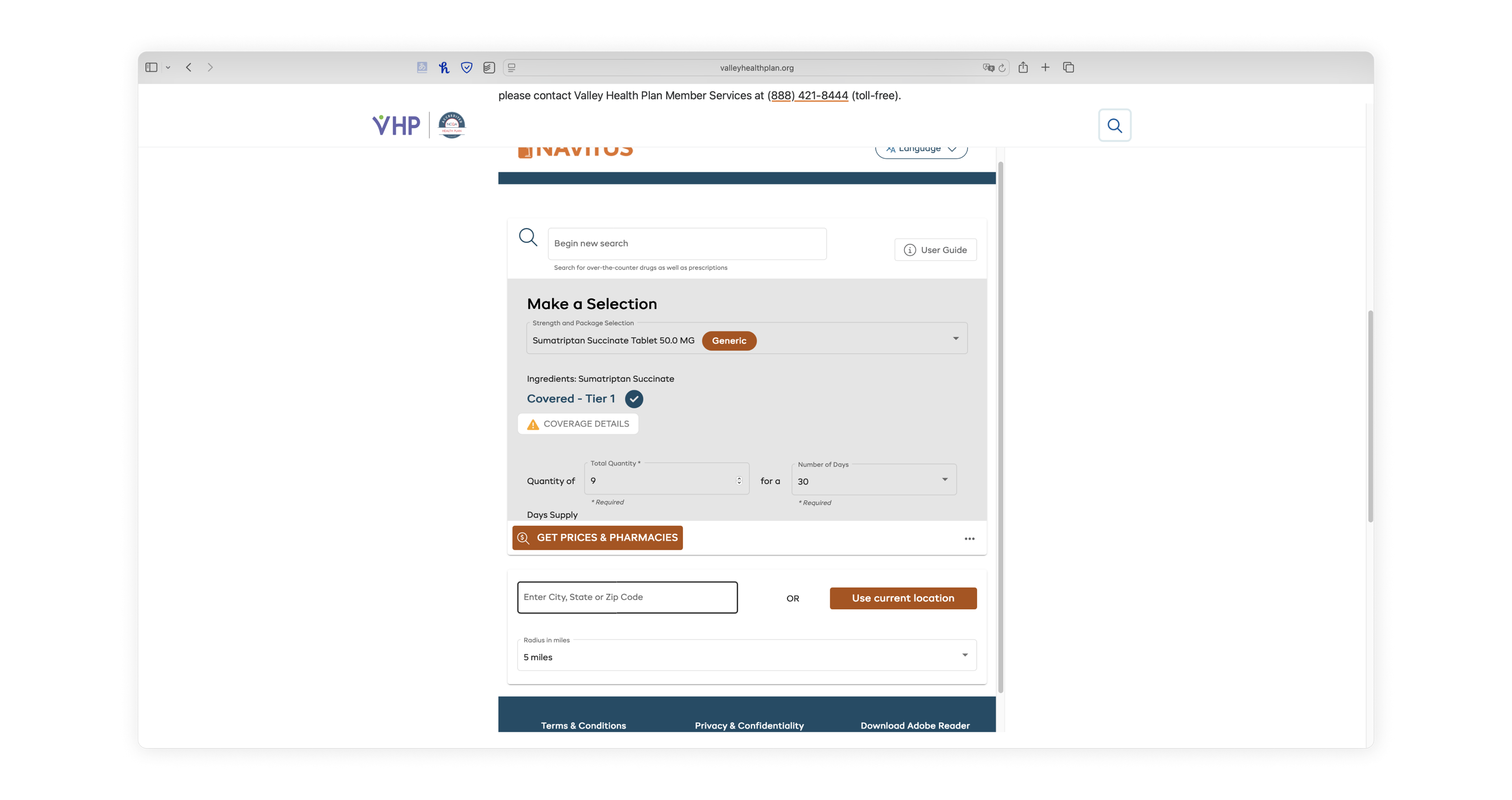
After choosing the desired variant, the user is informed that their medication is, in fact, covered, but still slightly alarmed by the warning icon next to the "coverage details" button

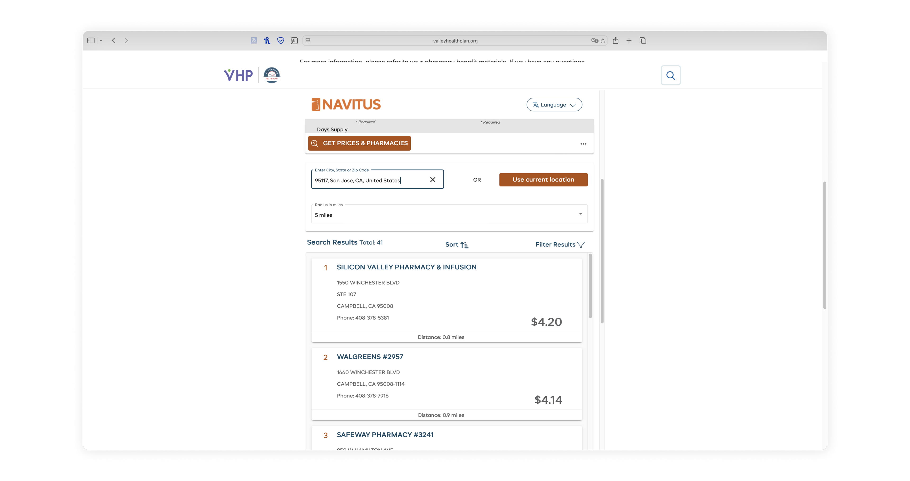
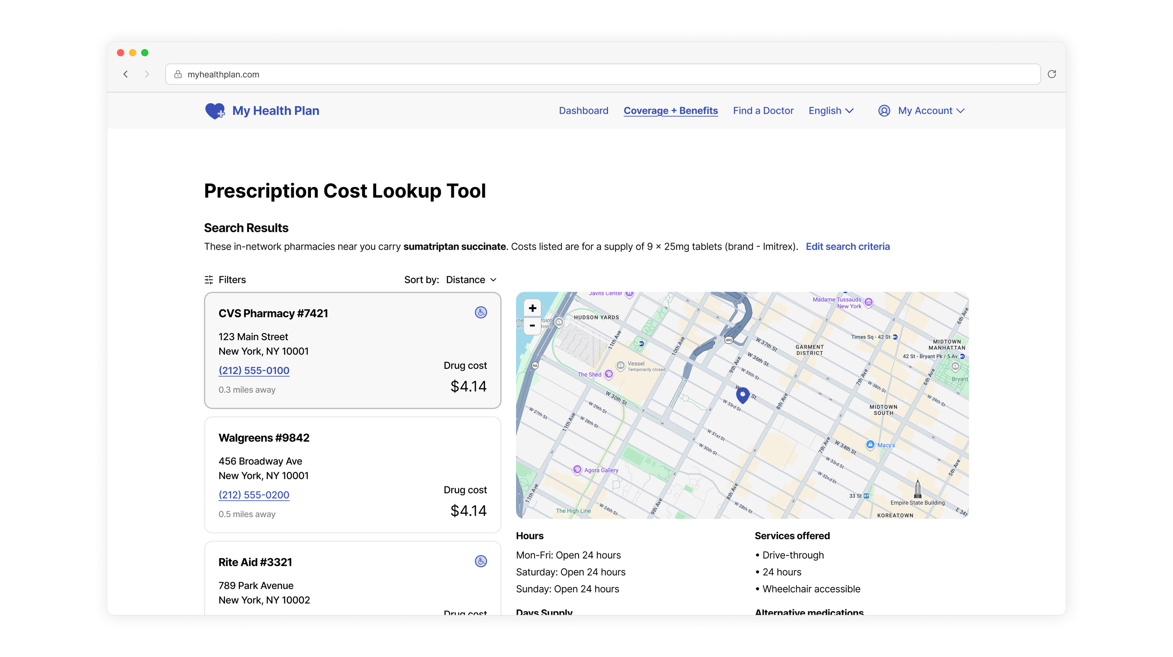
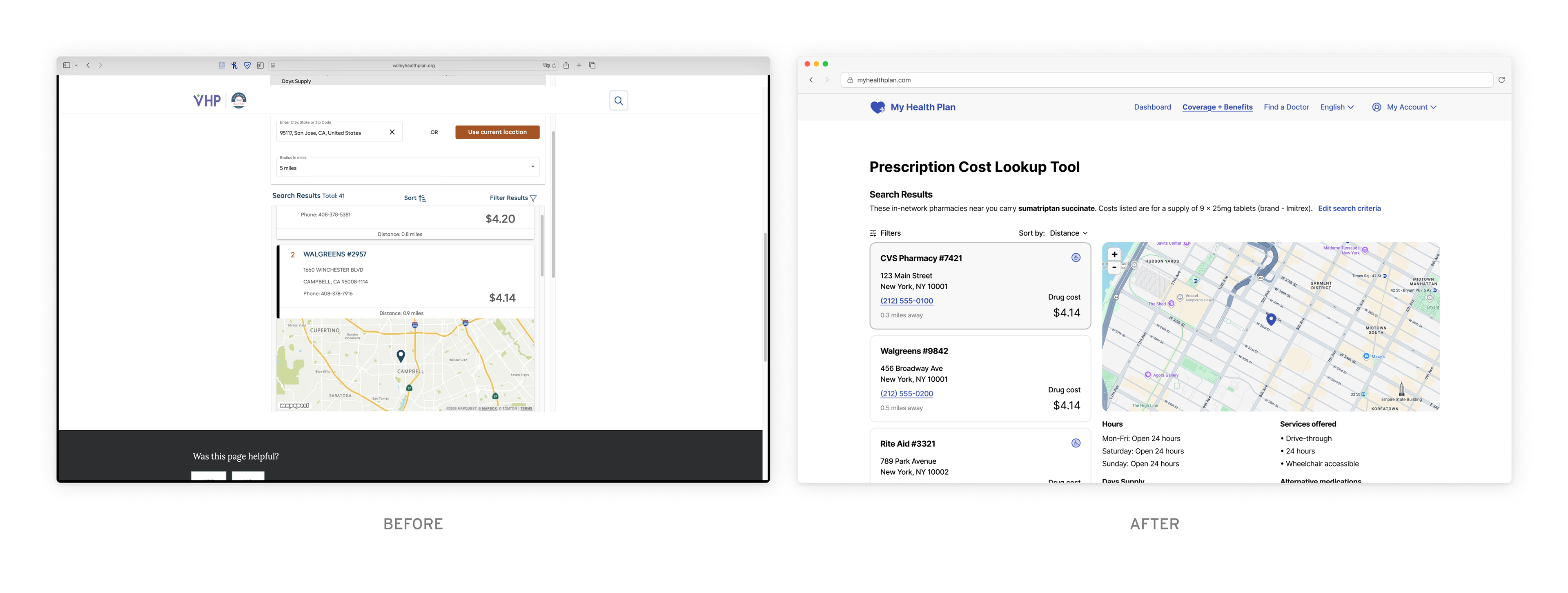
After inputing the rest of their search criteria, the user battles against a triple Scrollception on the results page

Distilling complexity into a simple user flow
After observing the current tool's flow and encountering various pain points from a user's perspective, I simplified the complexity of the tool down into its essential intended user flow. The biggest pain point I encountered was the ever-increasing number of scrolling frames within more scrolling frames, making it difficult to navigate the tool and view search results. 
In order to clarify what steps actually needed to be included without the distraction of the web design itself and its various usability issues, I distilled the basic steps and information needed for each into a user flow diagram. 
Wireframing
Translating the user flow into a Testing wireframe
Next, I used my user flow chart as a starting point for a new wireframe for the drug cost lookup tool. At the user flow stage, I had thought about the logical breakdown of the steps, which helped me decide what steps and how many would go on each page in sequence. 

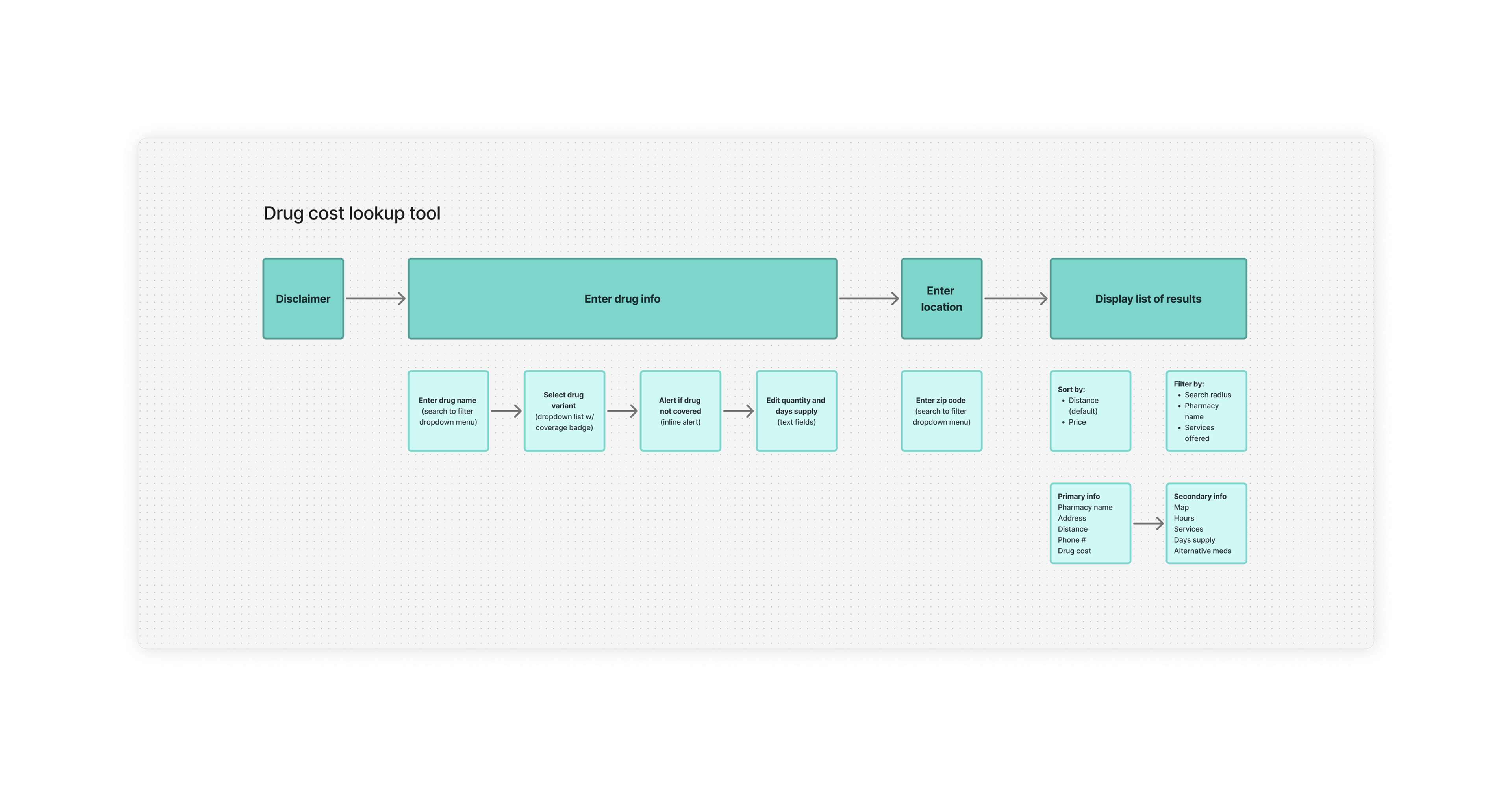
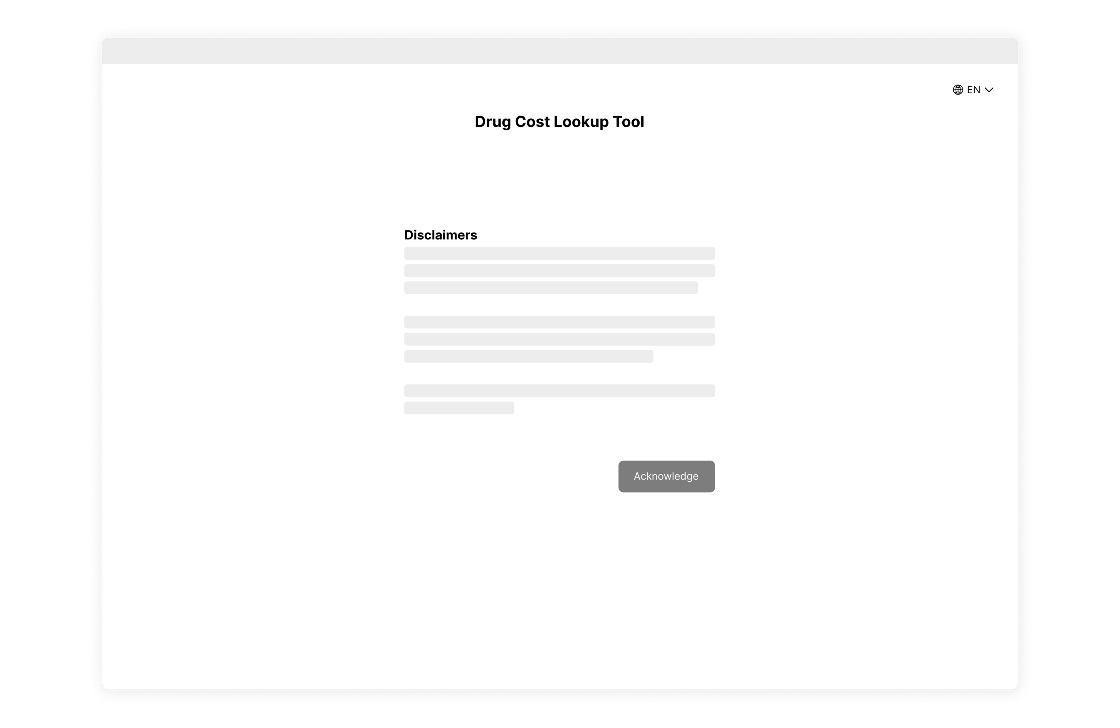
Knowing the high-regulation nature of healthcare and insurance, I assumed the disclaimers in the original tool were a legal constraint, so I included them in my redesign as their own introductory page requiring user acknowledgment before using the tool. 

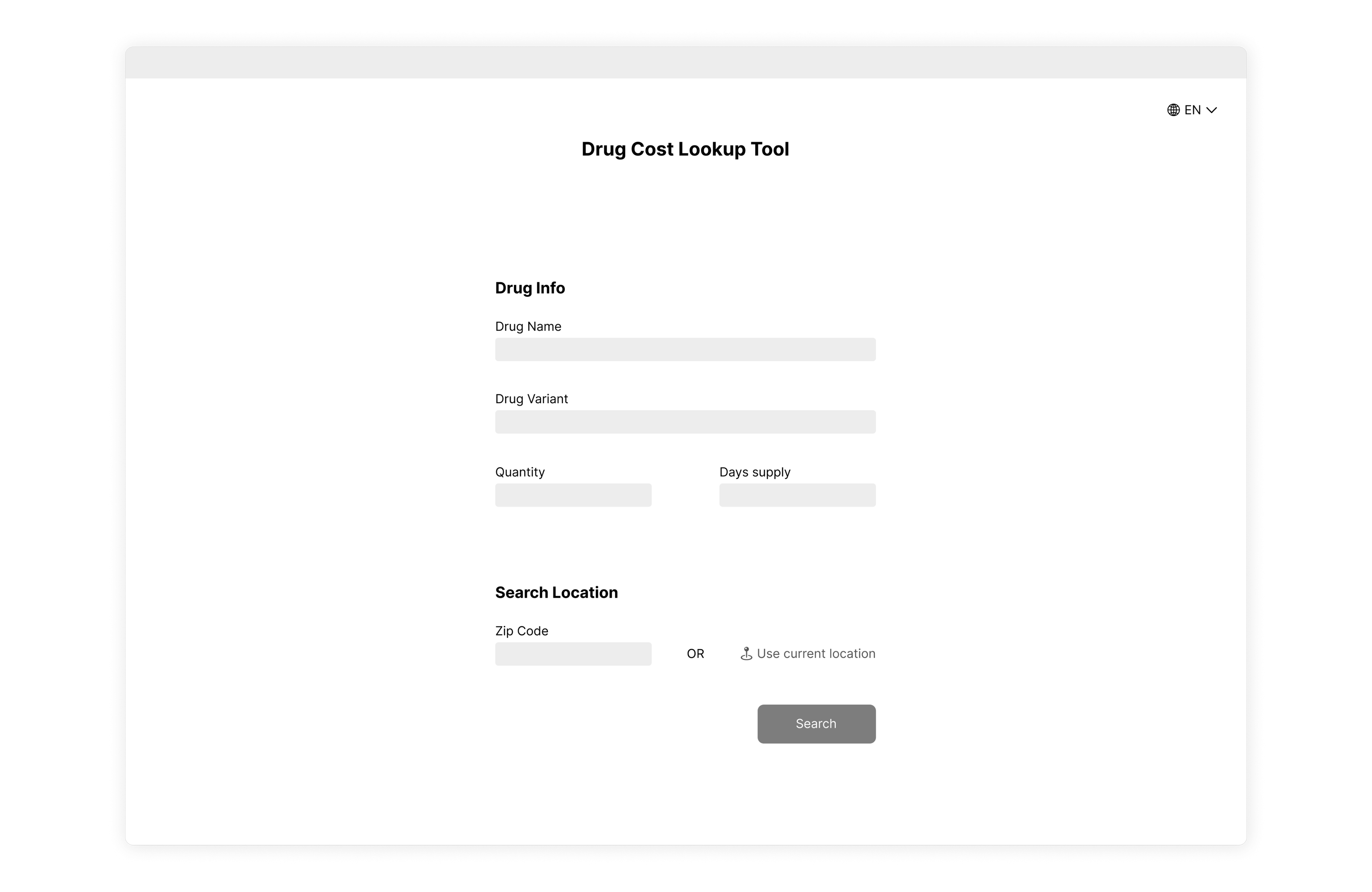
Without spending too much time on the visual design of the page, I constructed a simple and straightforward wireframe of the search criteria page where the user can input the required search information.

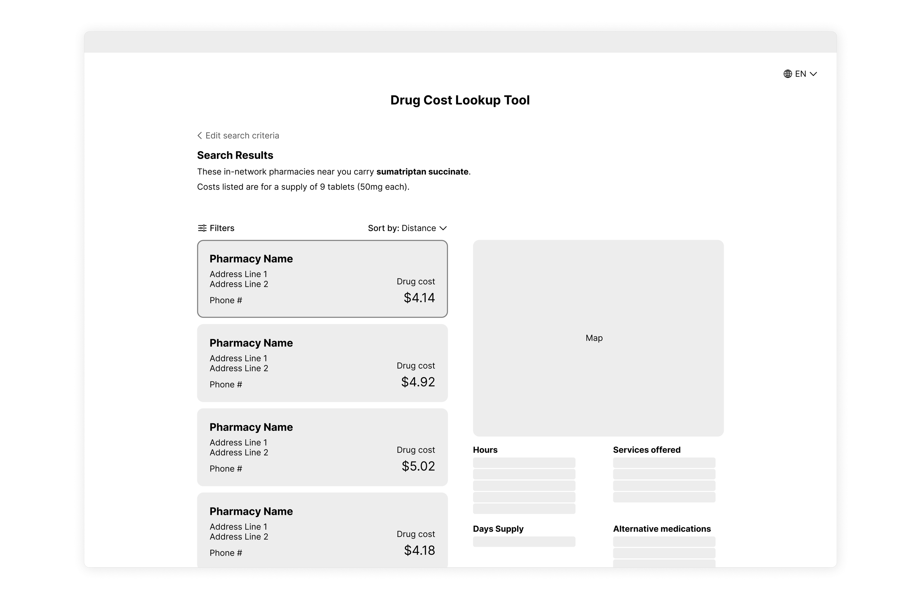
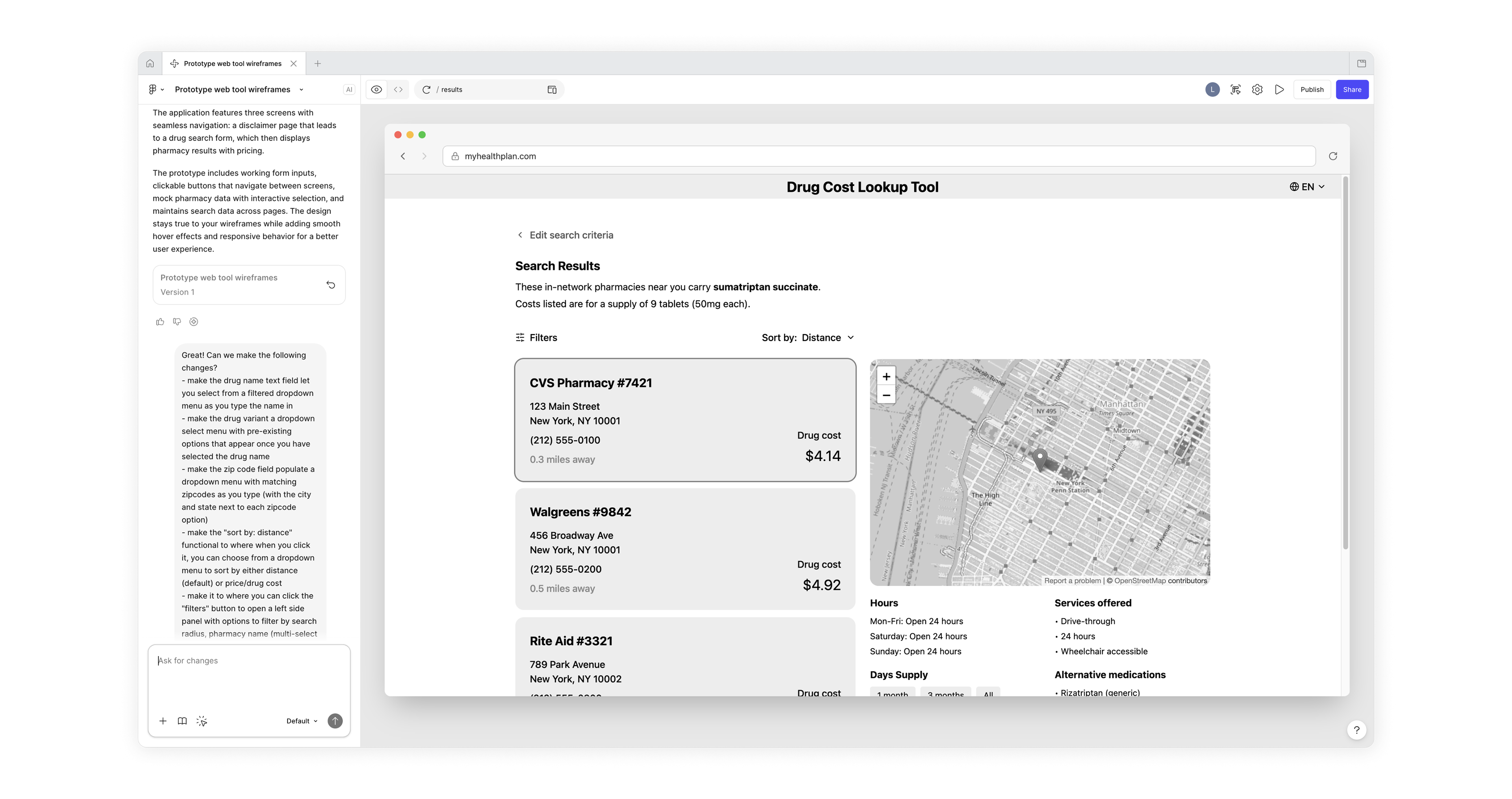
I designed a wireframe of what the search results page might look like, using more of the available screen area to provide a clear view of nearby pharmacies and the prescription cost at each, as well as other relevant details. 

Figma Make Prototype
Putting wireframes into motion with AI
In order to test my initial wireframe, I used Figma Make to translate my wireframe into a working prototype that I could test with users to uncover pain points. 
RITE Usability Testing
Testing to uncover user pain points
I recruited some users to test my prototype using a methodology called Rapid Iterative Testing and Evaluation (RITE). With each user, I asked them to complete specific tasks and observed their behavior in order to see how easy it was for them to accomplish the task. Using the observations from the test, I made adjustments to the prototype to address each pain point before testing with a different user using the same process, iterating several times to arrive at the final result. 

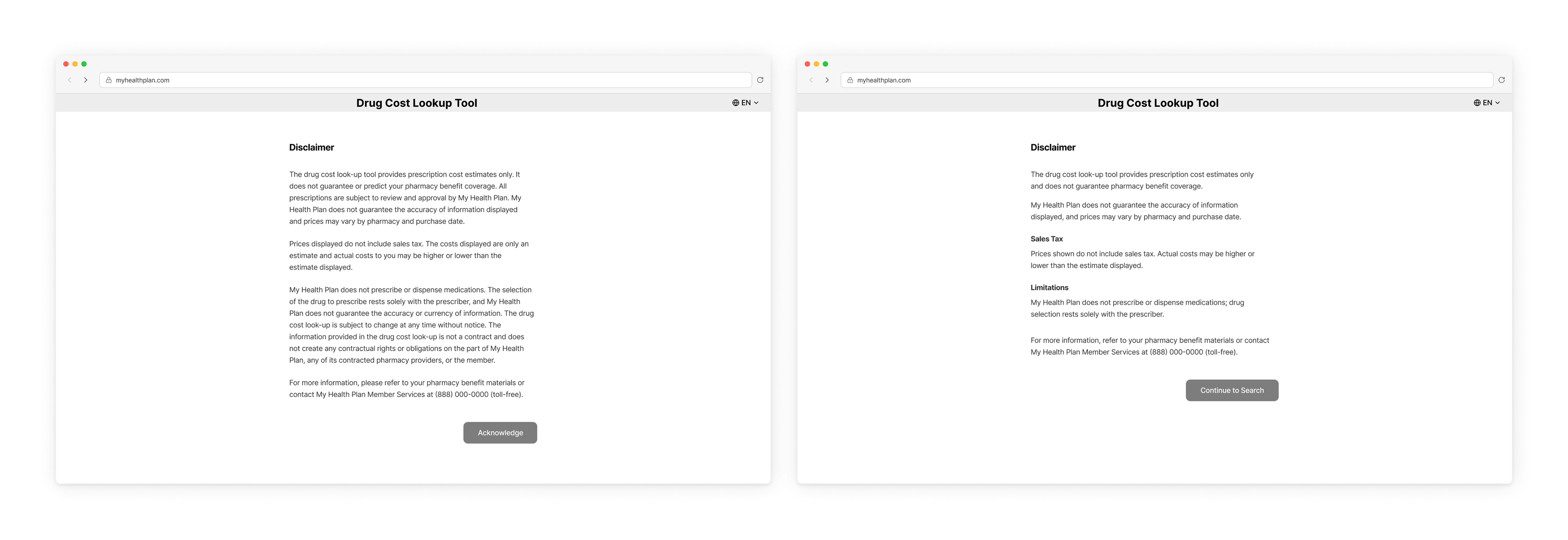
Noting that users did not read the disclaimer during testing, I made the text more concise and readable and updated the CTA for clarity. Ideally, I would consult with the legal team to assess the necessity of this disclaimer.

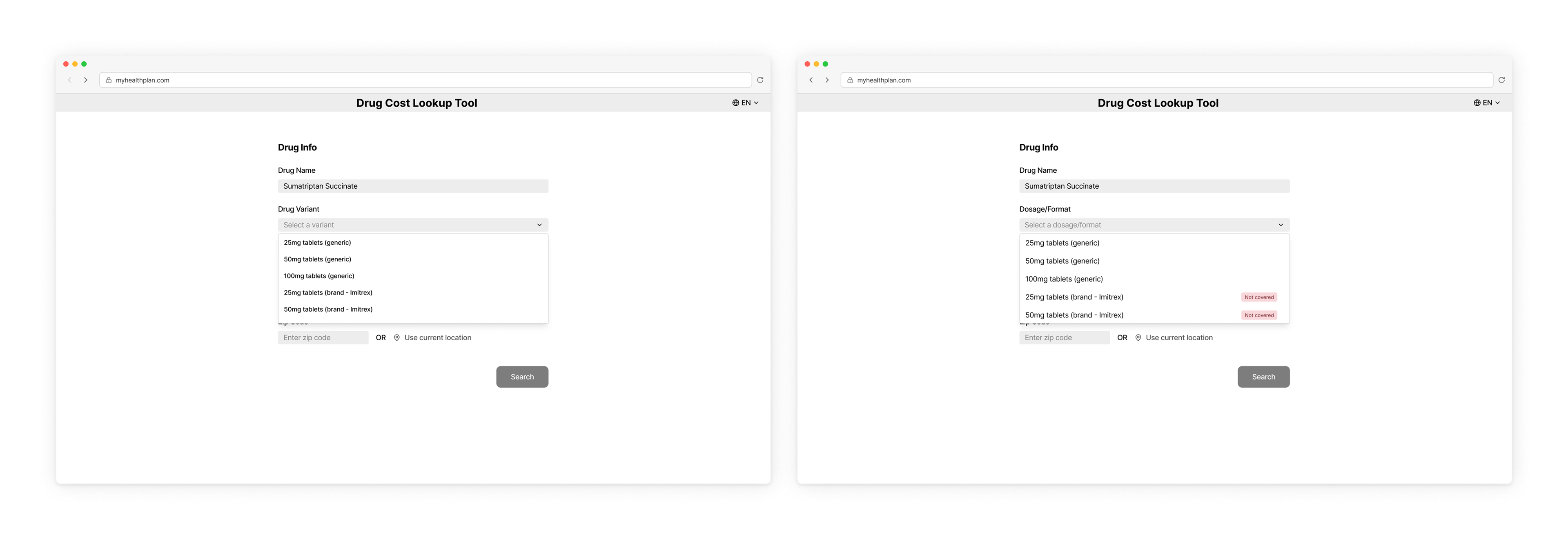
Based on confusion during testing, I changed the text of some form field labels and placeholder text, as well as adding badges for non-covered drug options within the dropdown menu.

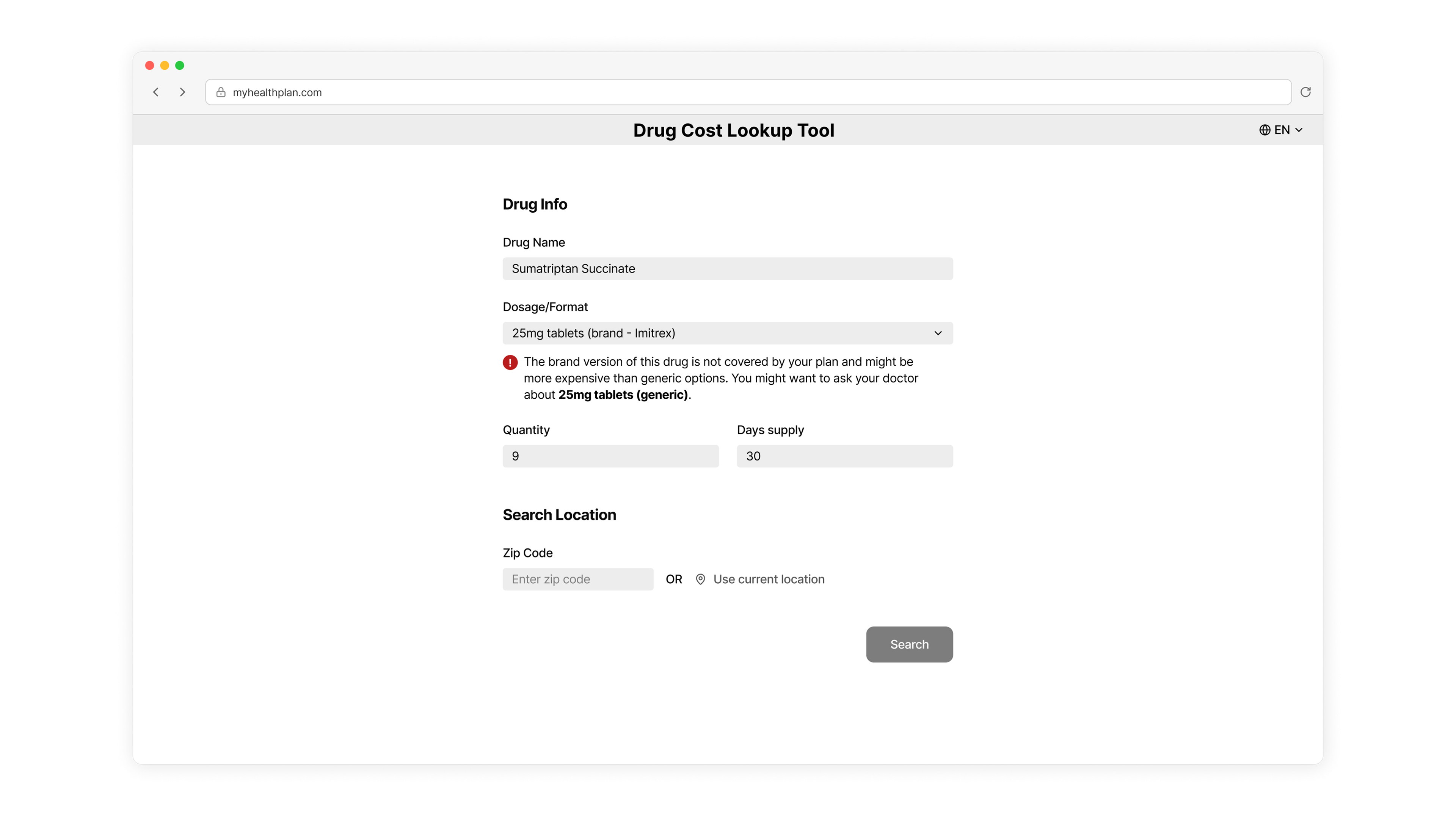
I also added a clearer inline alert when the user selects a non-covered drug, suggesting a covered alternative, in contrast to the original tool, which alerted the user without a clear explanation or advice.

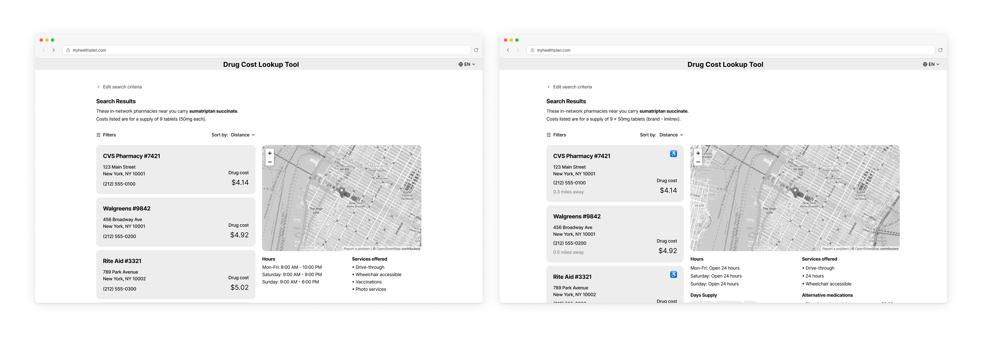
Changes I made to the results page included adding a "wheelchair accessible" icon and distance label to the pharmacy result cards and adding a price filter option. 

Visual Design
Creating a Clean, accessible interface
After my improving the user experience through iterative usability testing, I moved on to the visual design of the tool to create a viable final web tool design. Throughout this process I followed WCAG accessibility standards for color contrast and typography. I also aimed to follow a consistent color palette, creating a fictional healthcare company and using the brand color for primary interactive and brand elements. 

Similar projects

Back to Top